OgI EYEWEAR


Content is property of OGI Eyewear and The Optical Foundry.
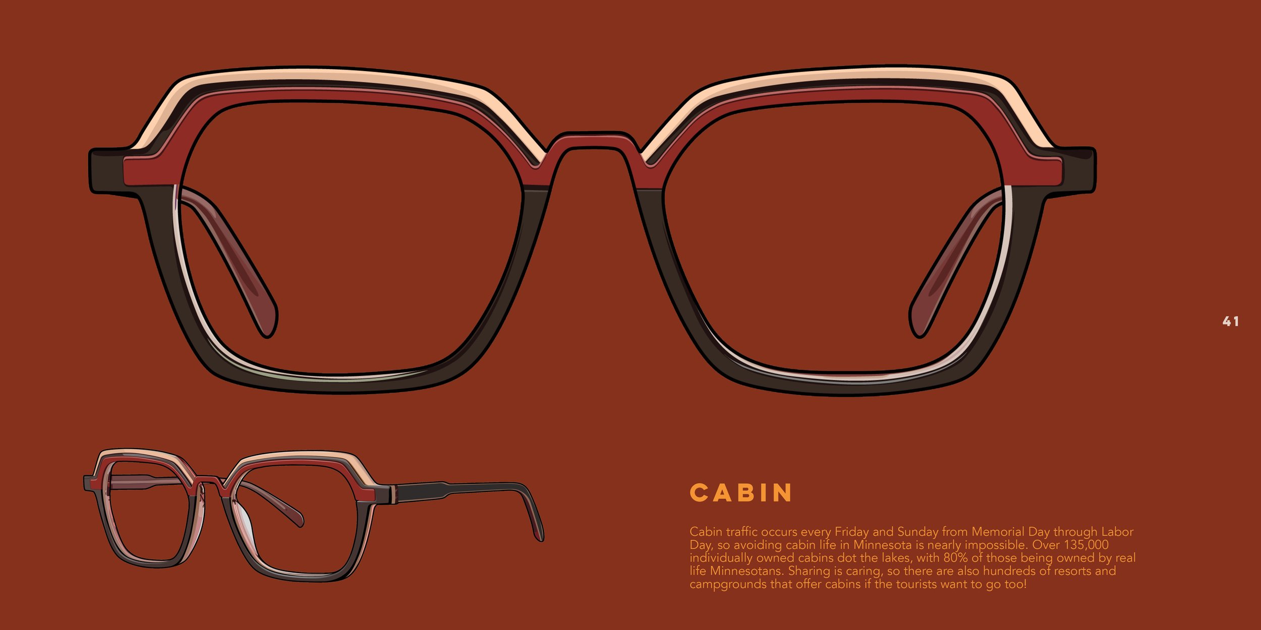
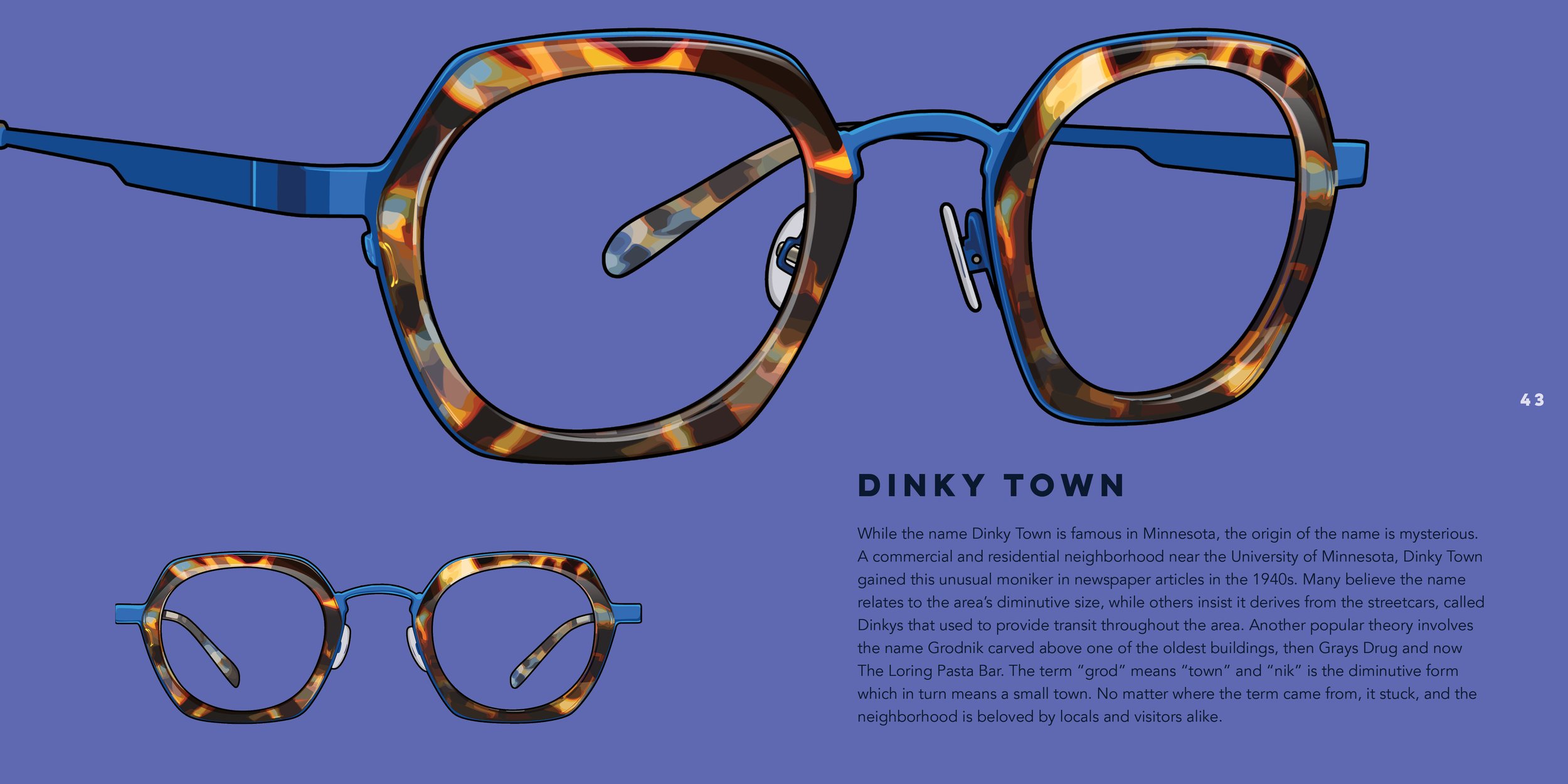
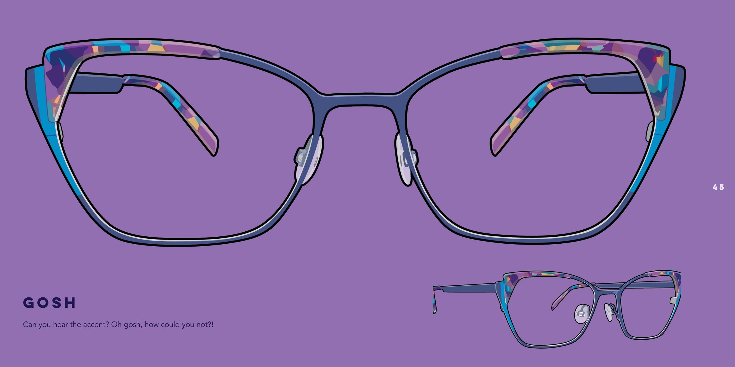
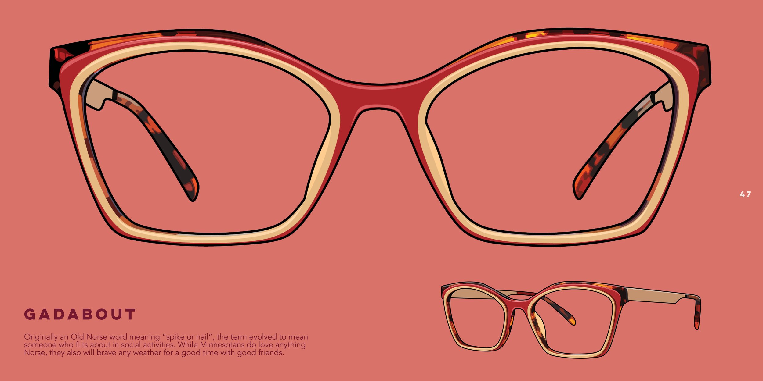
2025 Calendar
ogi eyewear
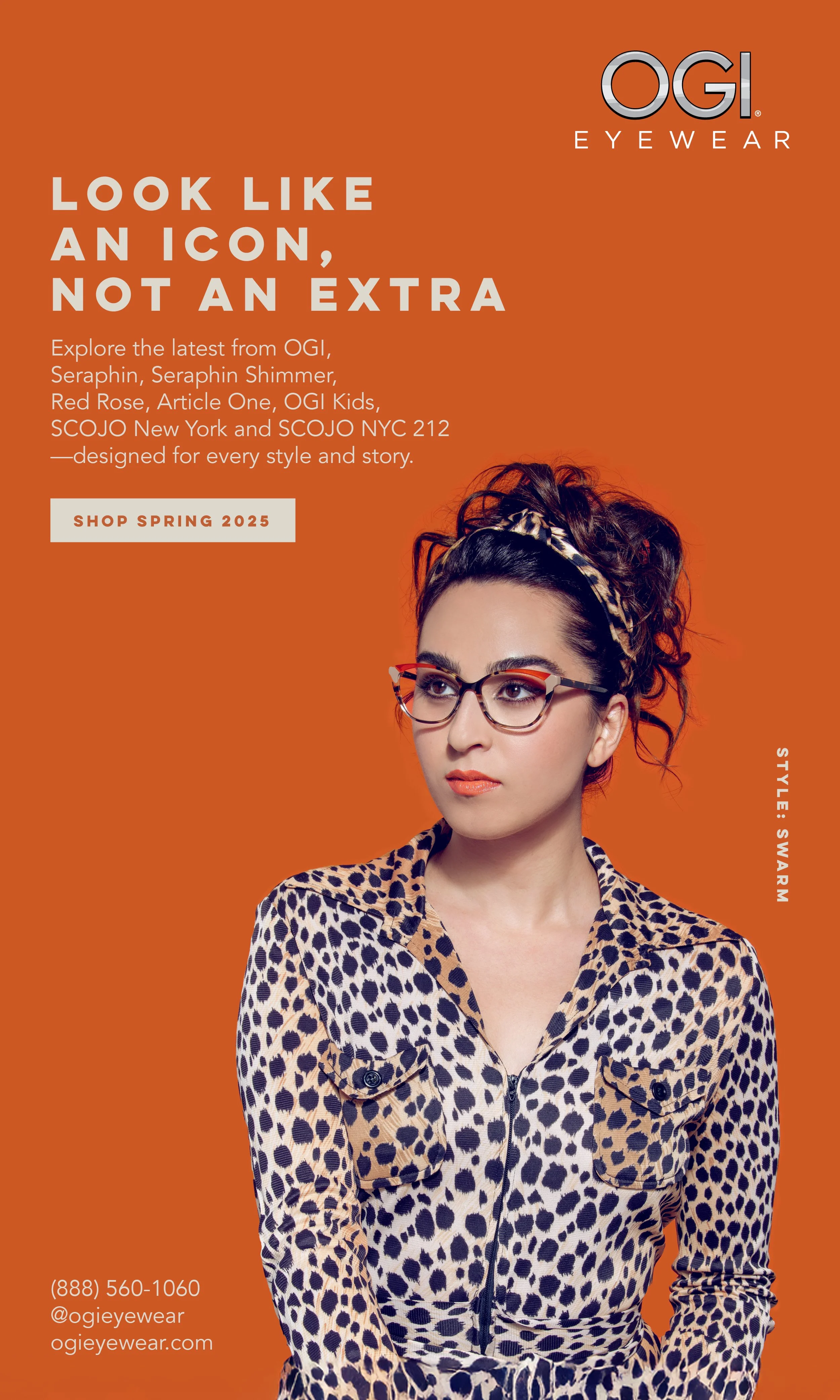
At OGI Eyewear, I designed across all of their eight brands, OGI, Seraphin, Seraphin Shimmer, SCOJO New York, OGI Kids, Red Rose, Article One, and SCOJO NYC 212, each with its own distinct tone, from bold and youthful to sleek and classic. My work spans both print and digital, including booklets, brochures, email campaigns, social media assets, and more. As I gained autonomy, I led projects with minimal direction including written copy for ads or personal art direction. I learned to work on multiple brand identities (at times consecutively) while maintaining consistency and clarity in execution. Scroll down to see my most recent and proud work with each brand!
All Brands
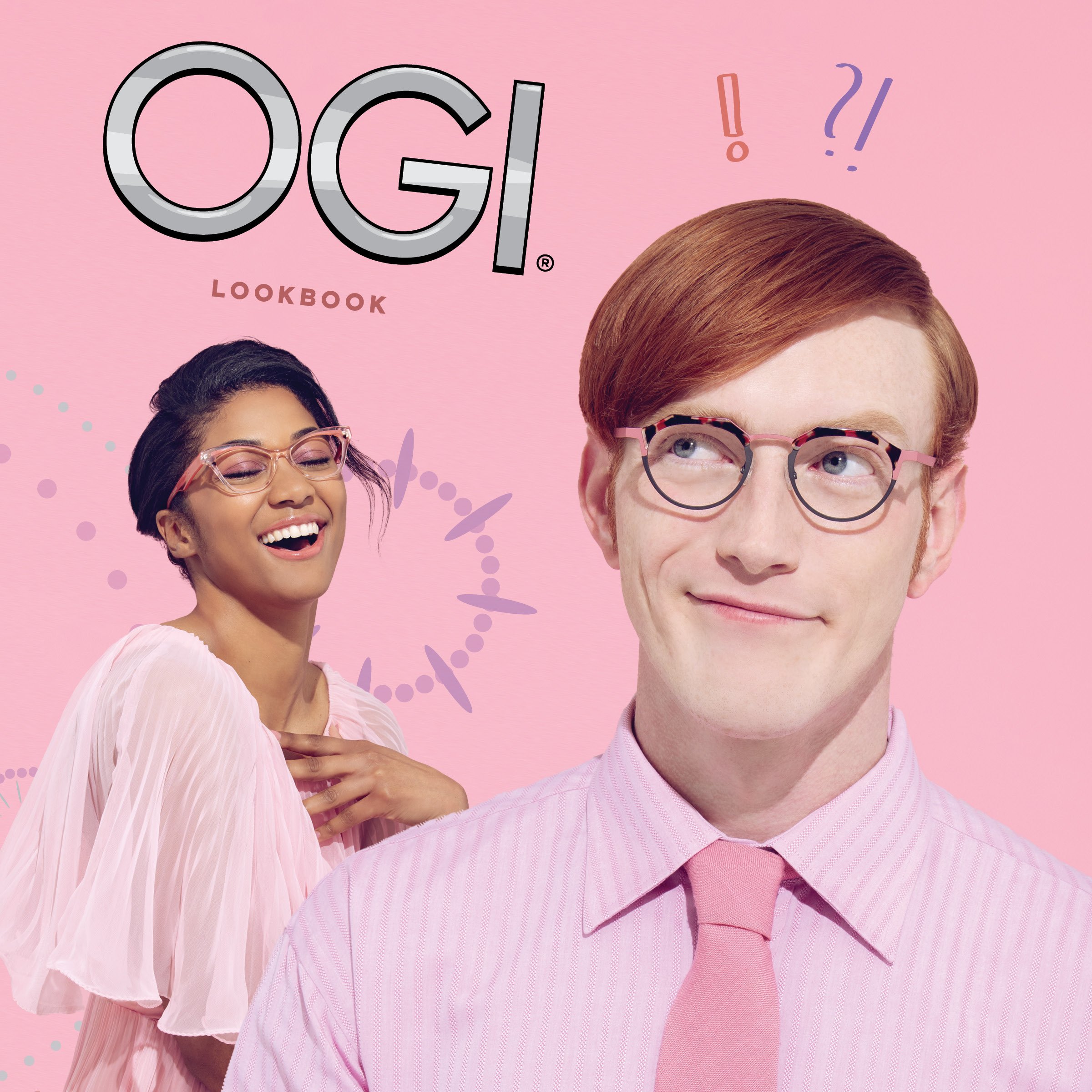
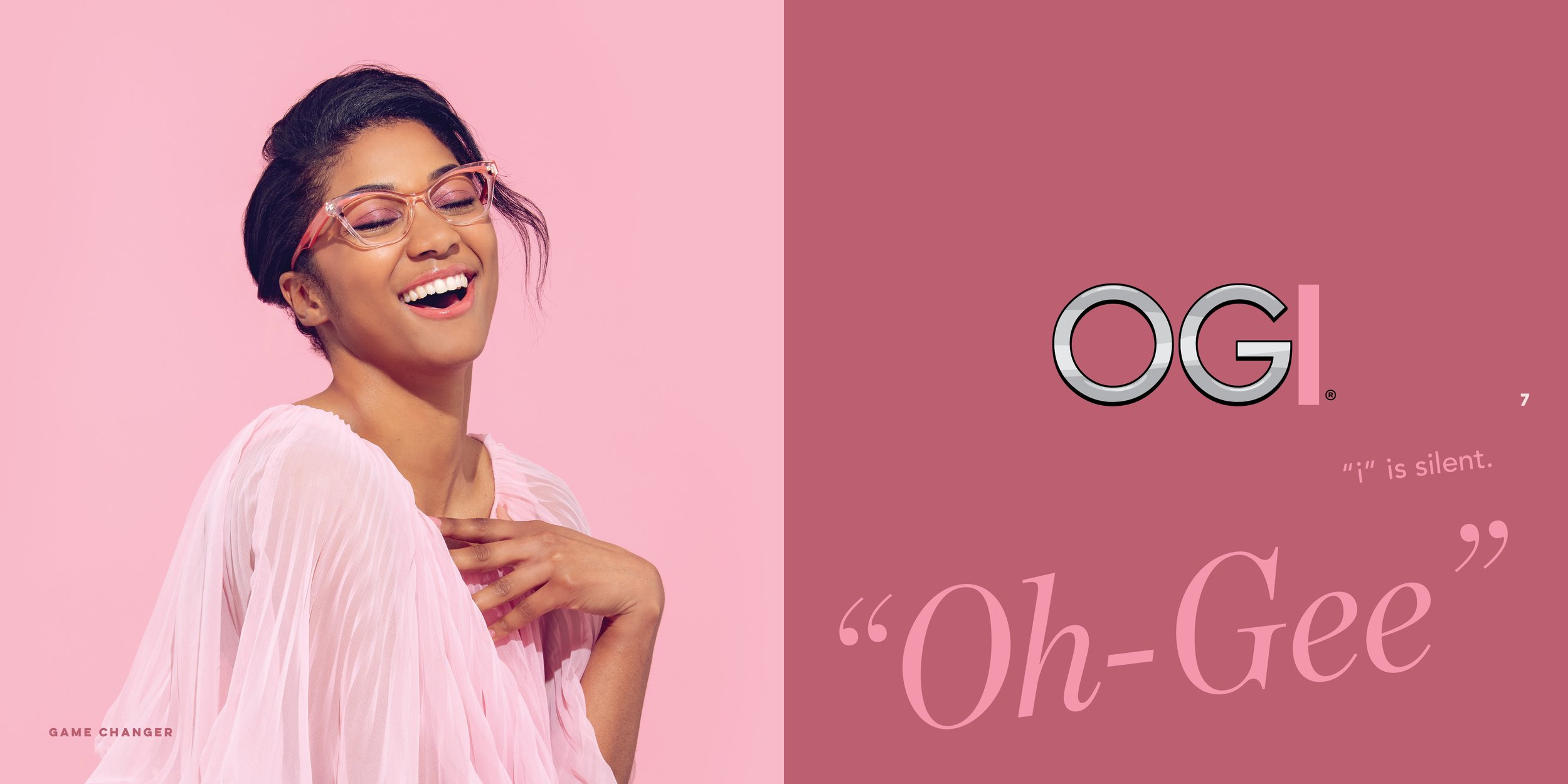
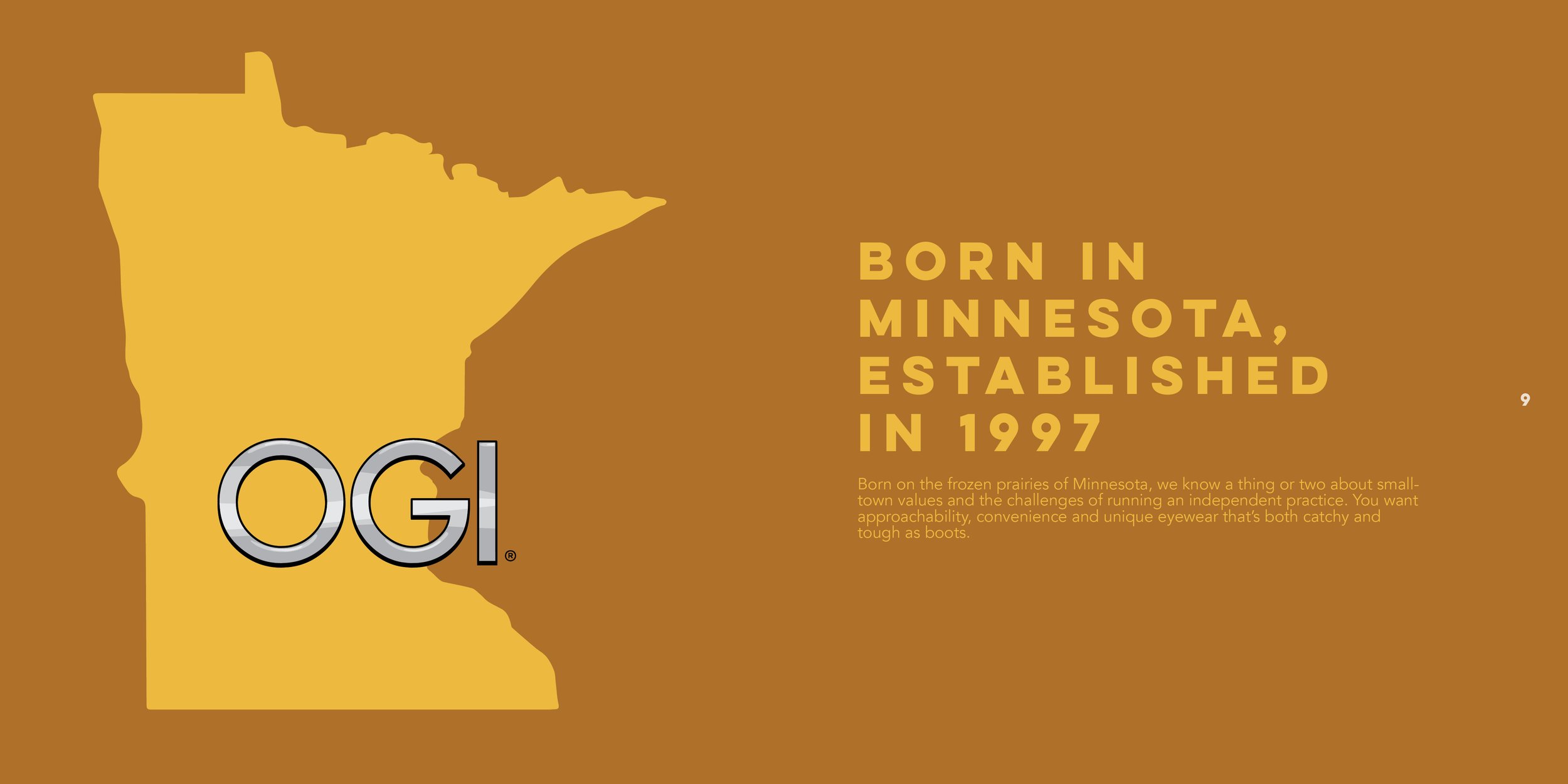
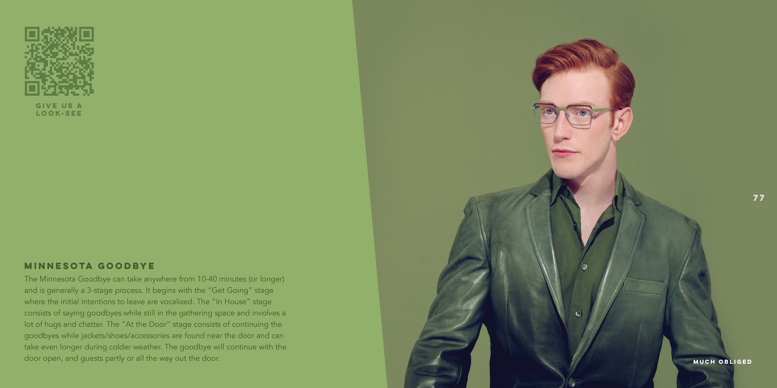
ogi
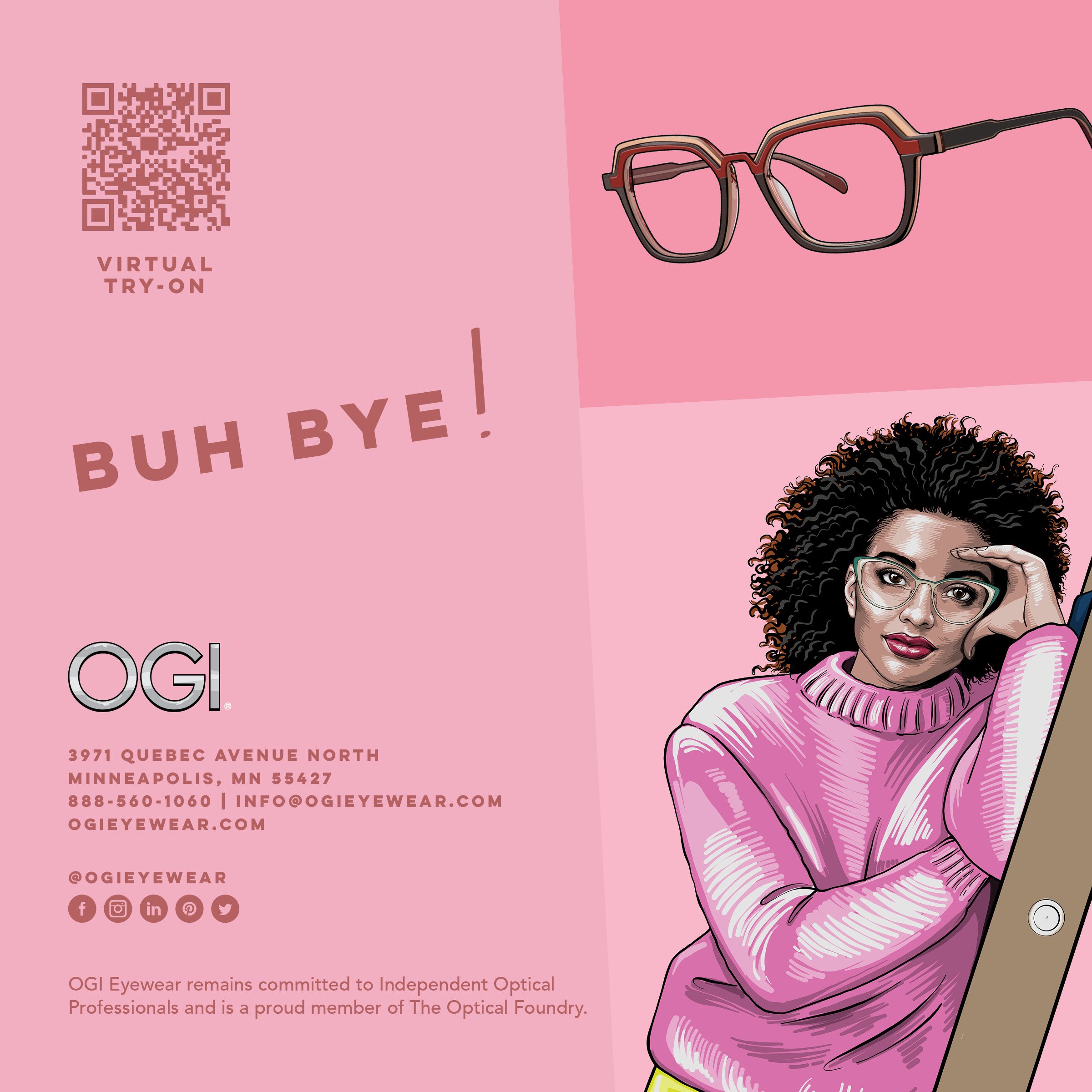
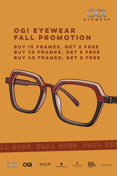
OGI’s identity leans into color, graphic storytelling, and bold compositions. I worked on a wide range of assets from digital ads and tote bags to in-store signage and social posts. Designing for OGI meant embracing visual fun while staying sharp and on brand, using punchy typography, vibrant palettes, and clever messaging to reflect its confident voice. I worked on two of OGI’s lookbooks and currently working on my third (2025 version coming soon…)!


Email Marketing
Email Marketing
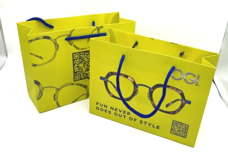
Tote Bag

Email Marketing

Email Marketing
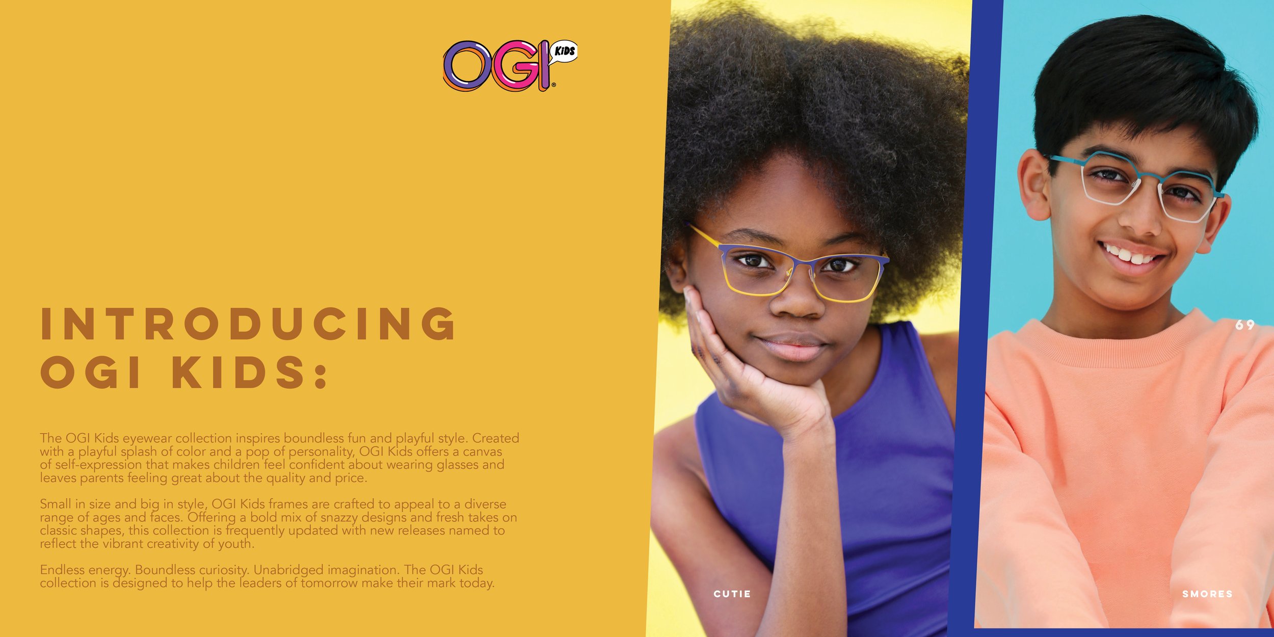
ogi kids
More coming soon….
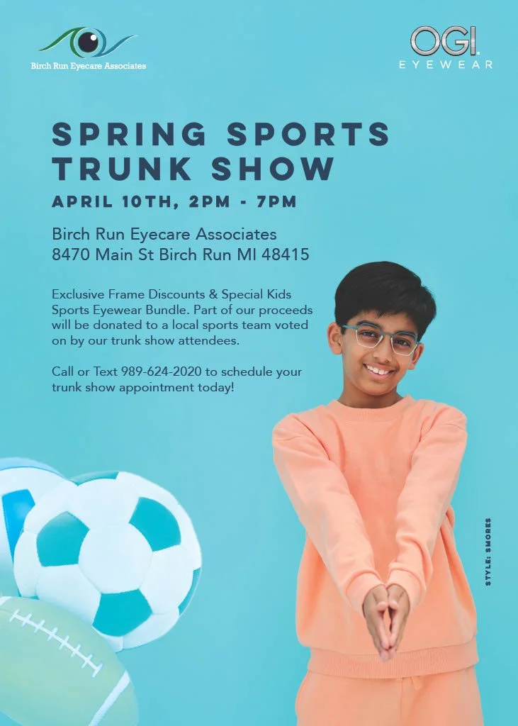
Flyer

Social Post
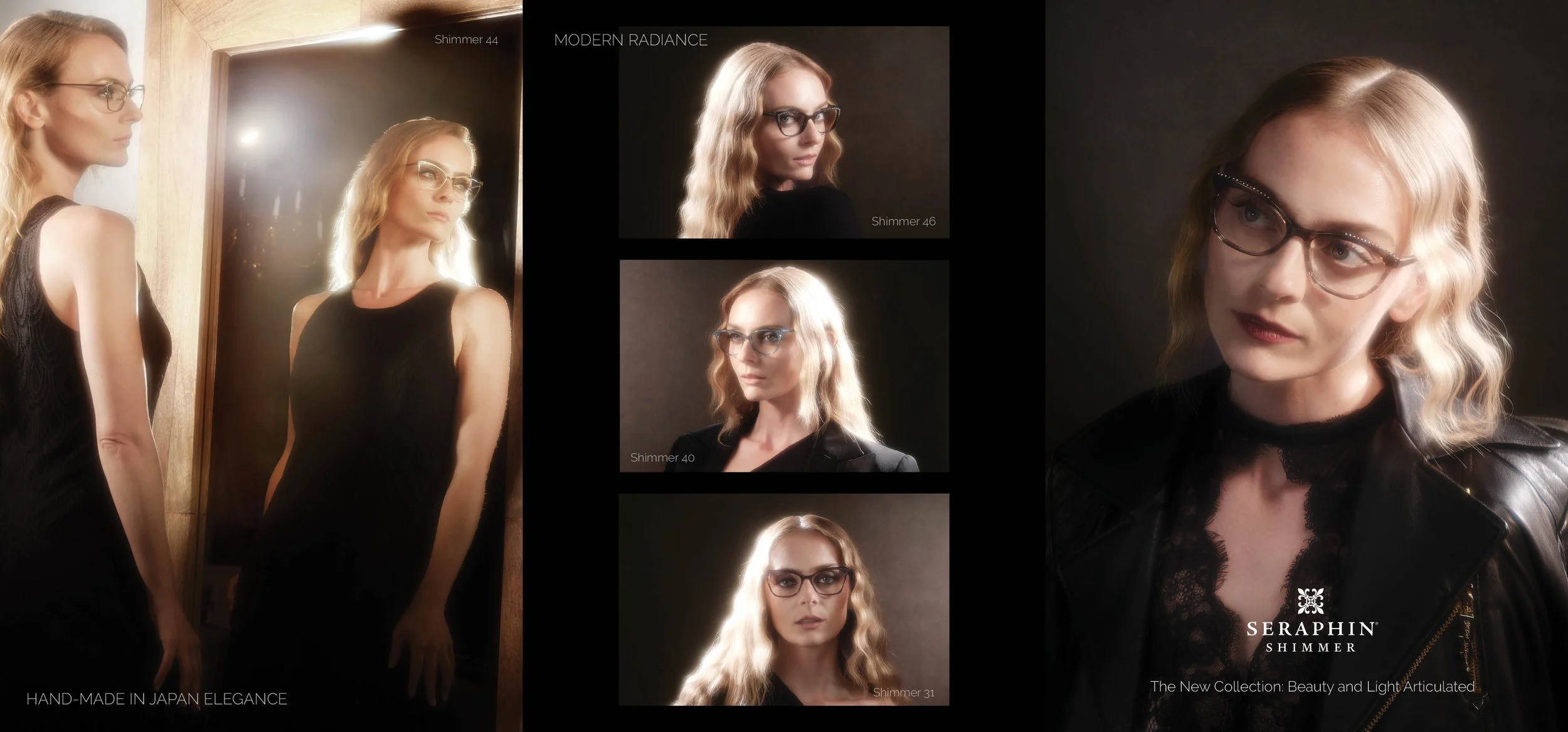
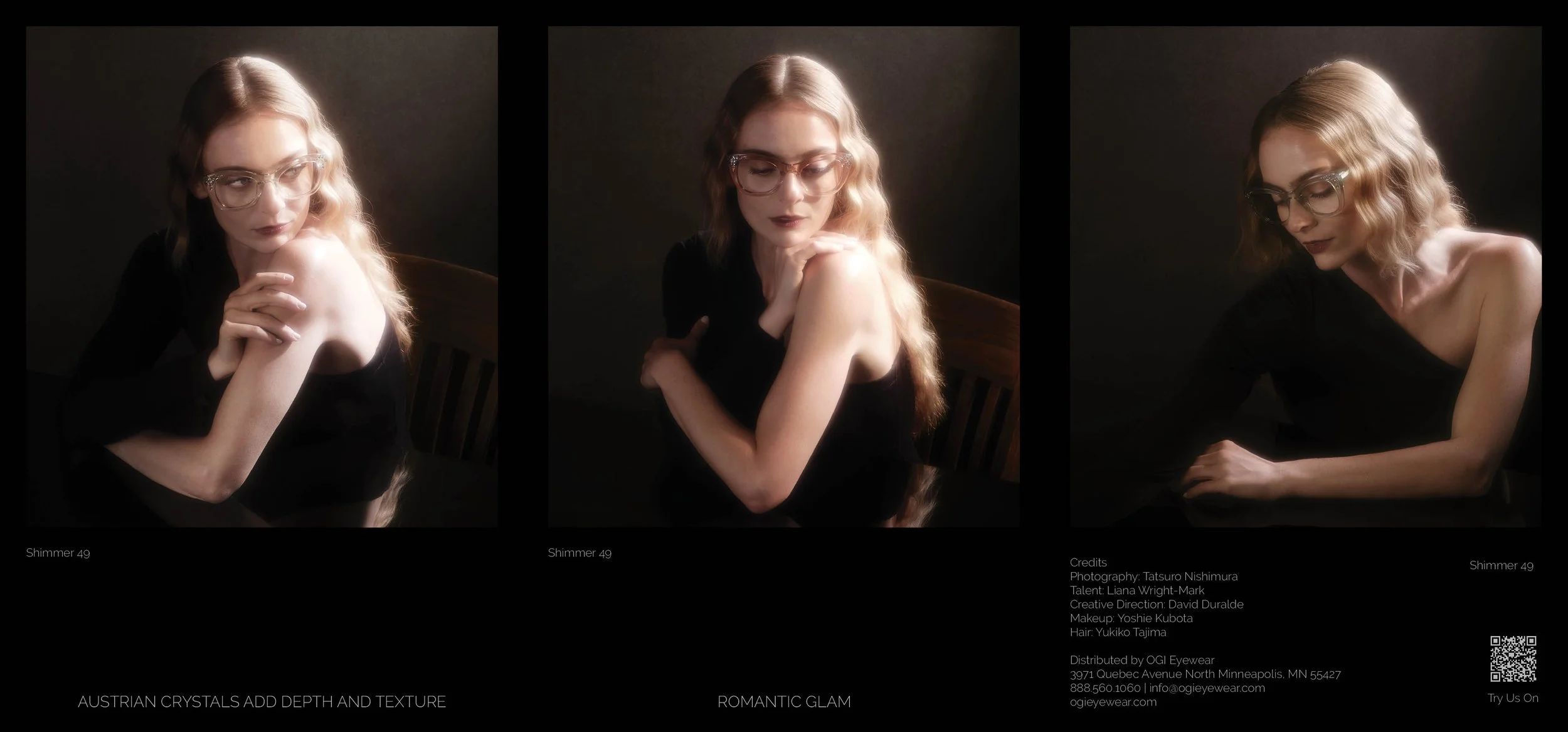
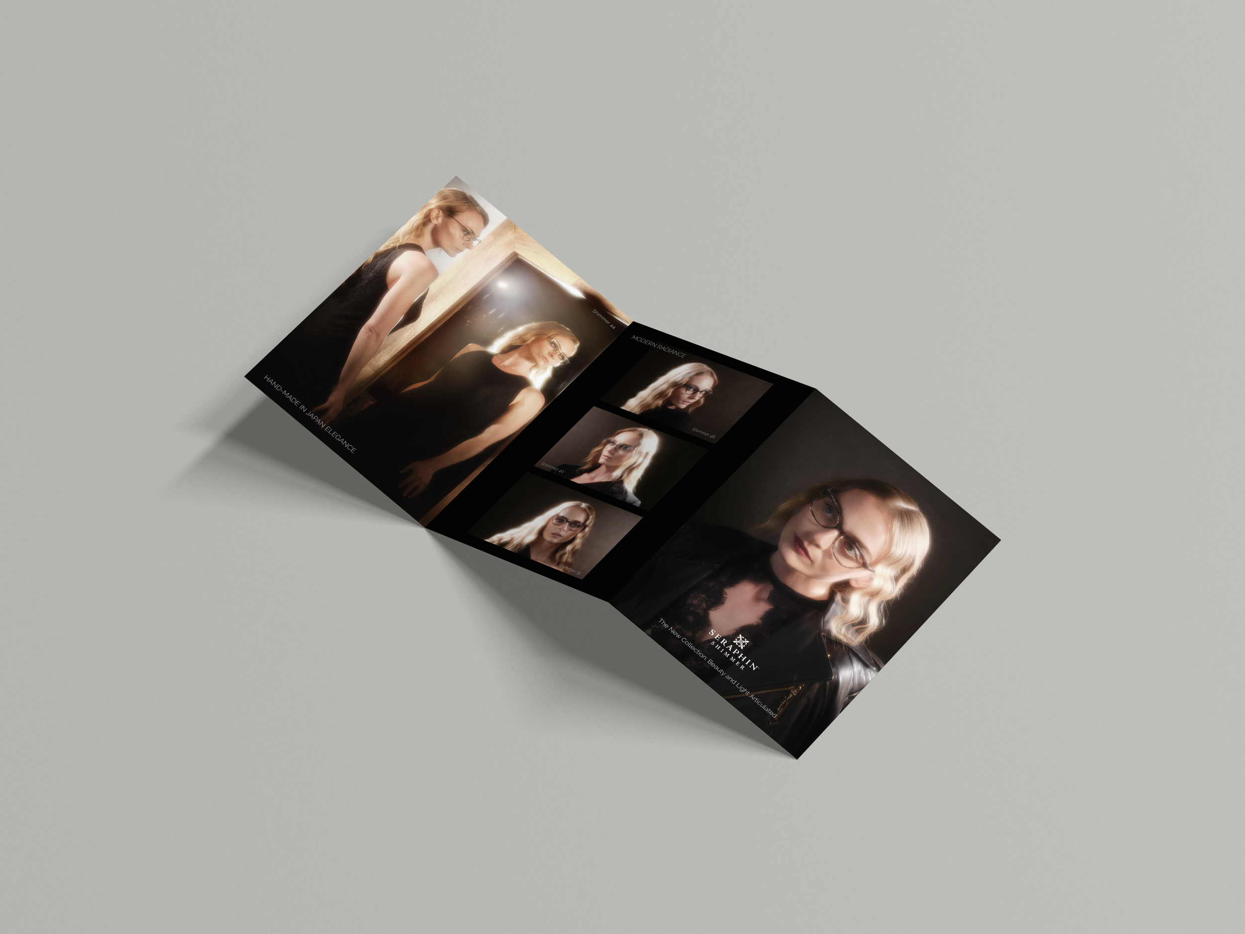
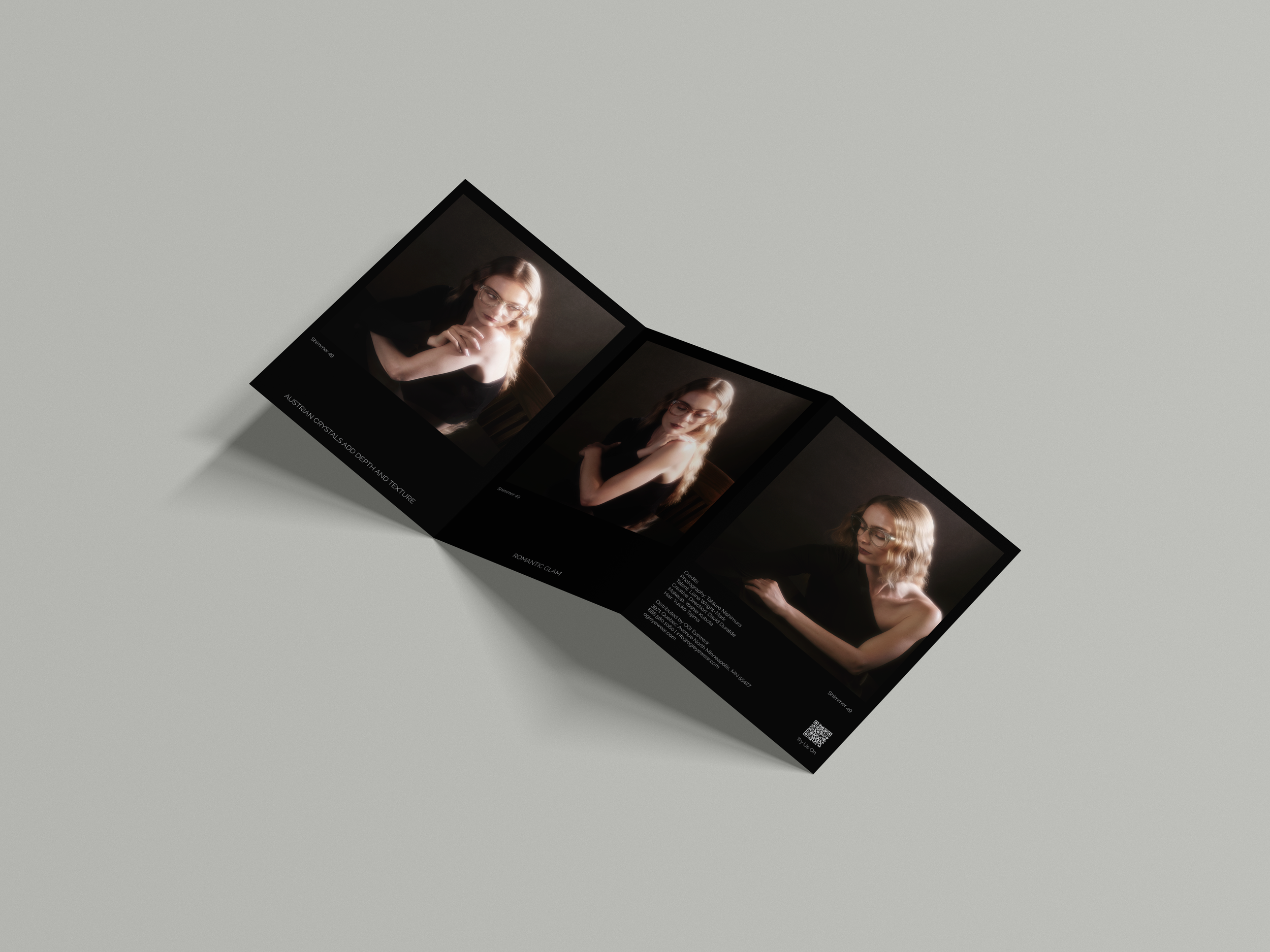
seraphin Shimmer
Seraphin Shimmer drives inspiration from vintage glamor with a contemporary edge. Designing for this brand required attention to the photography’s romantic and delicate mood. I created pieces like tri-fold brochures and printed ads that felt refined while aligning with the brand’s elegant vintage glam. My digital work consisted of social media posts and email campaigns that emphasized
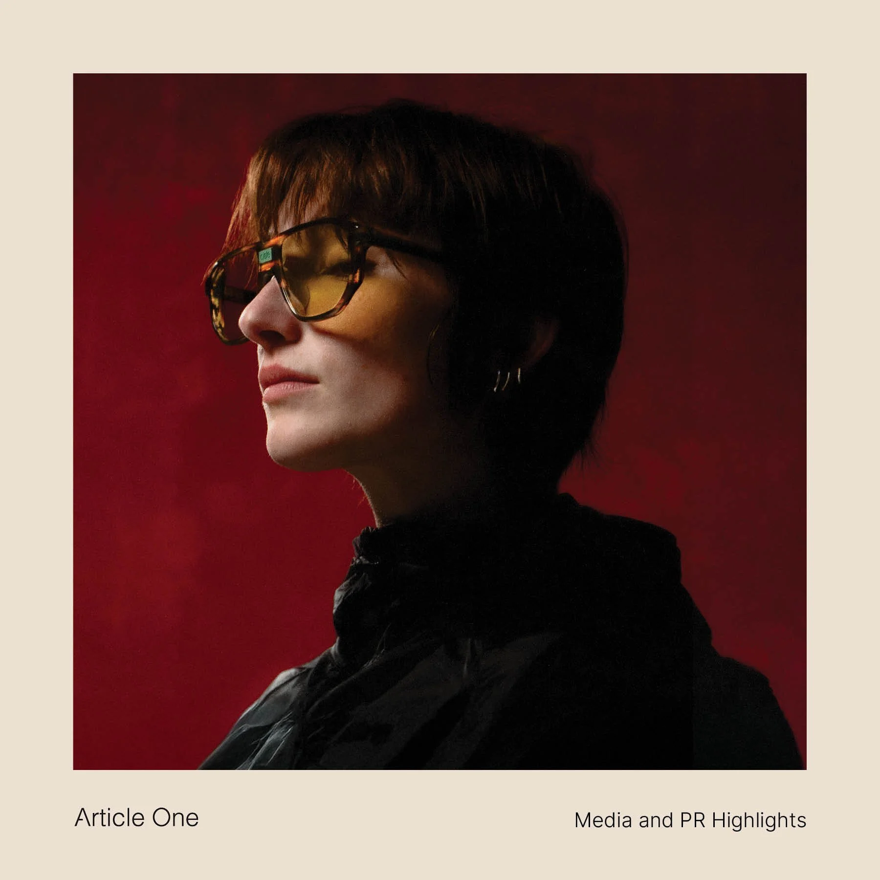
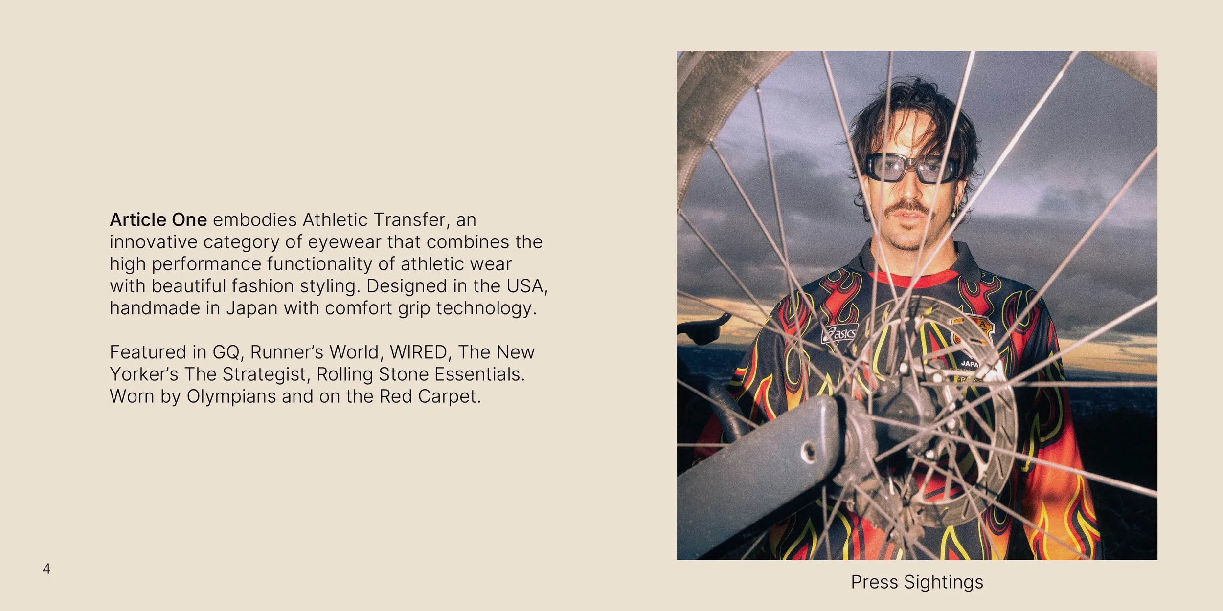
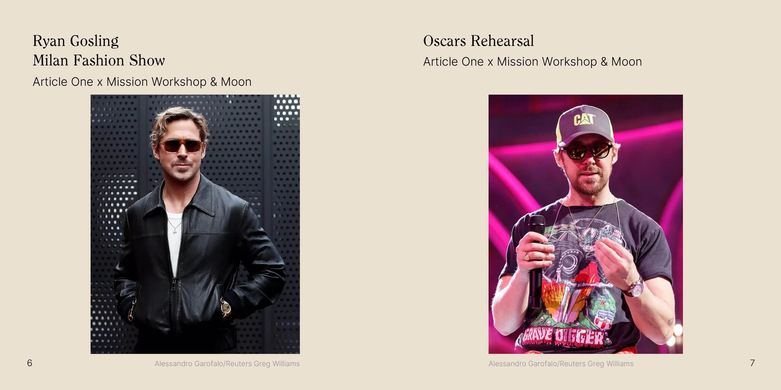
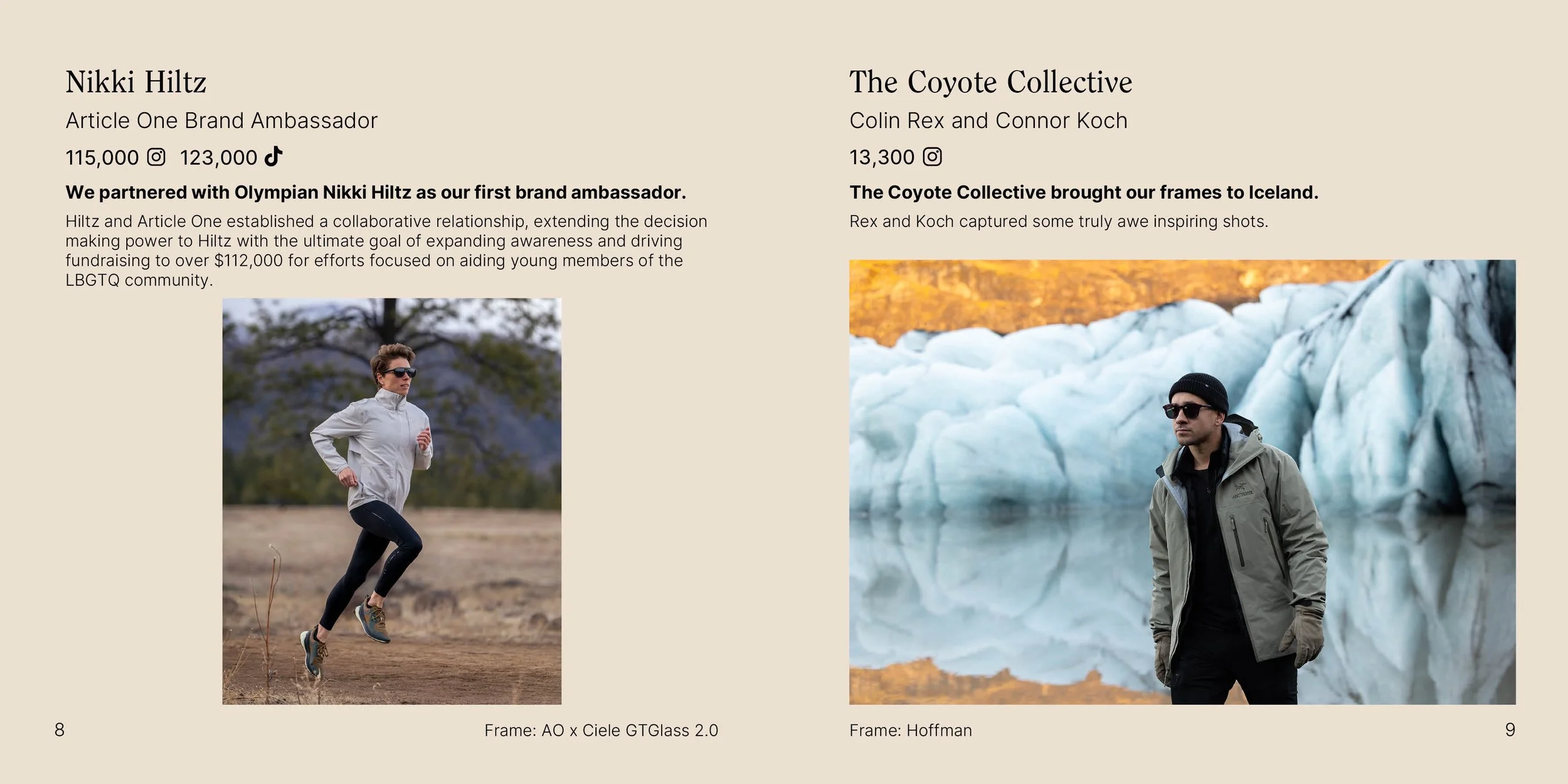
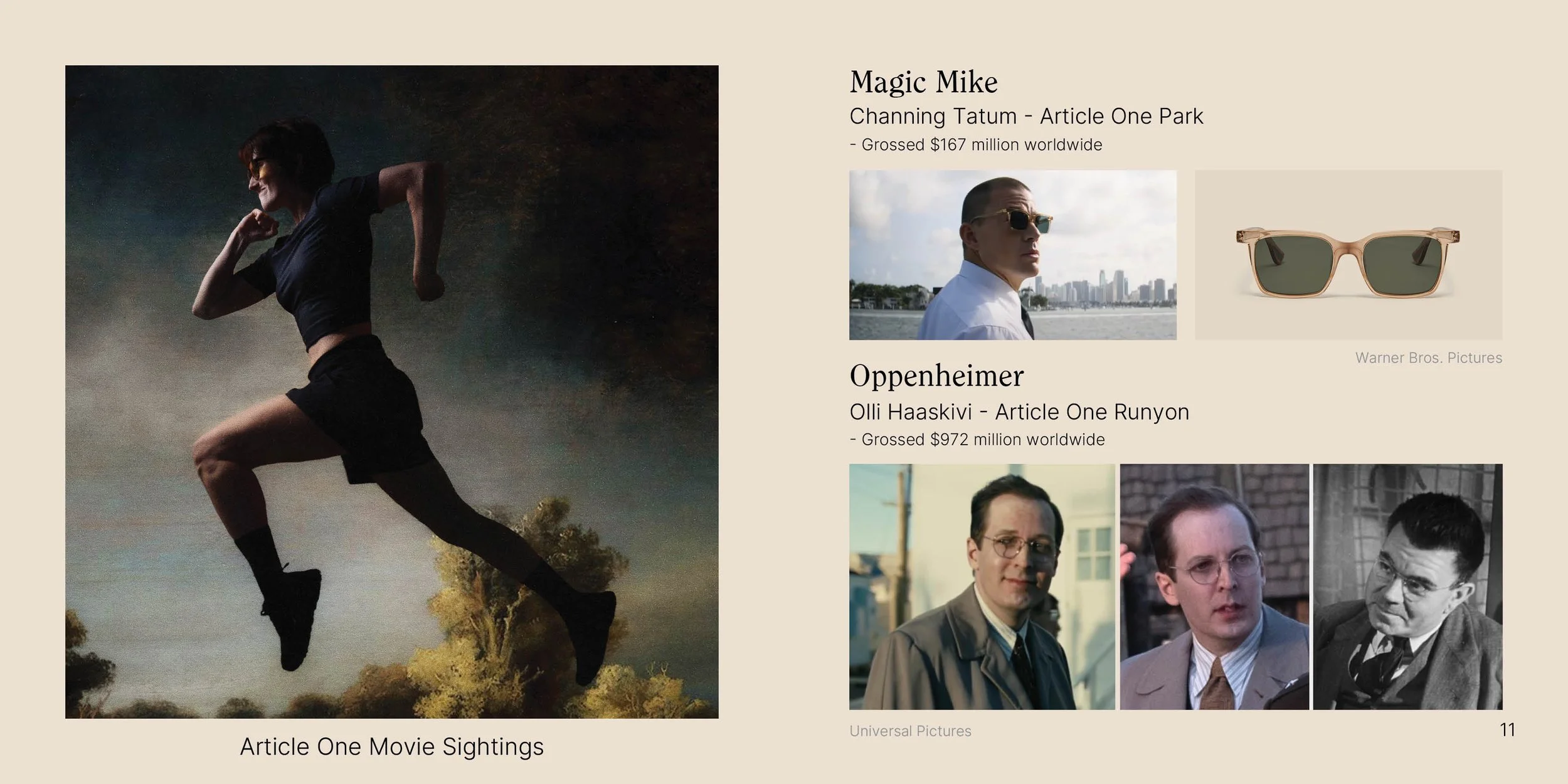
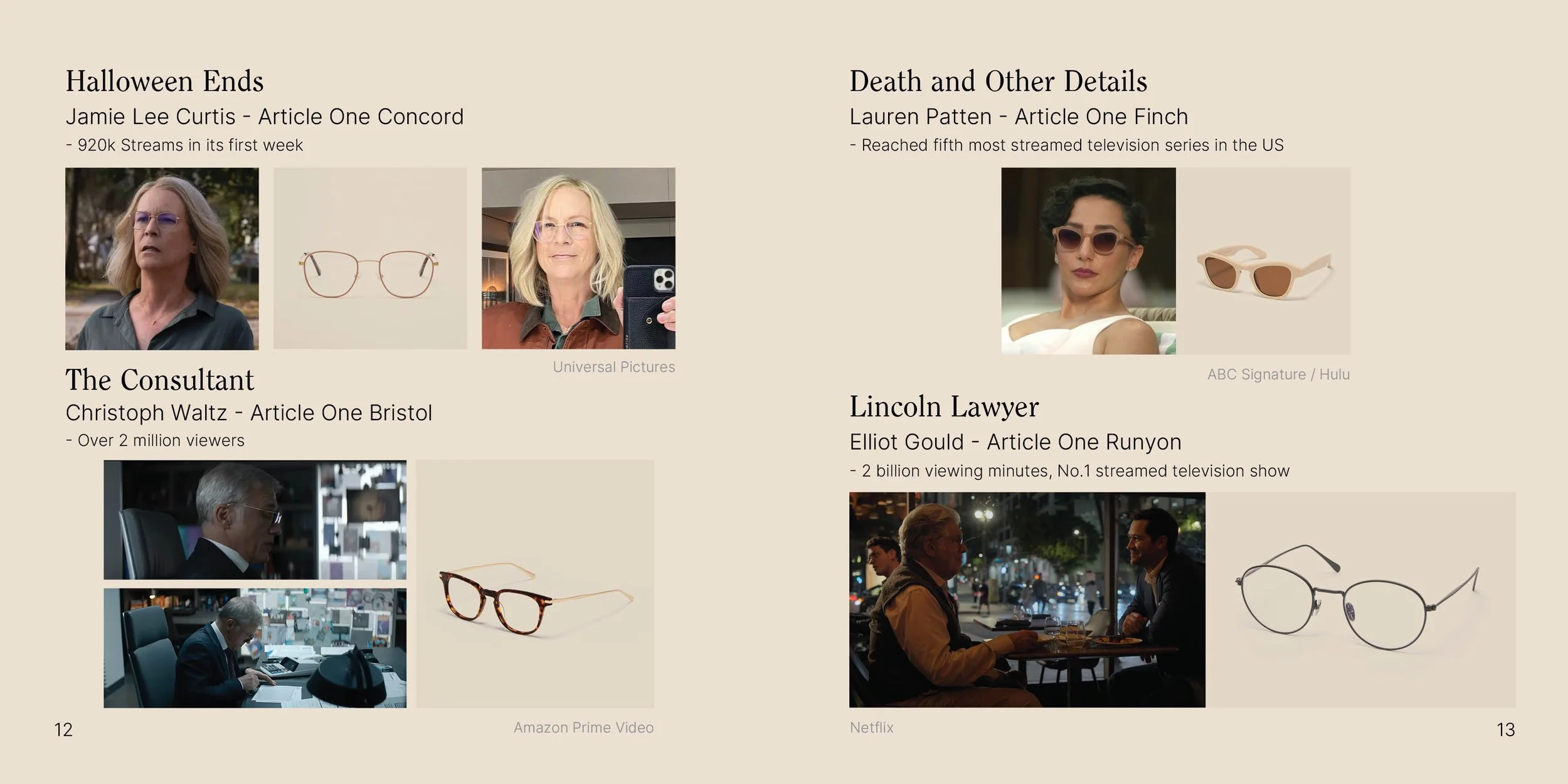
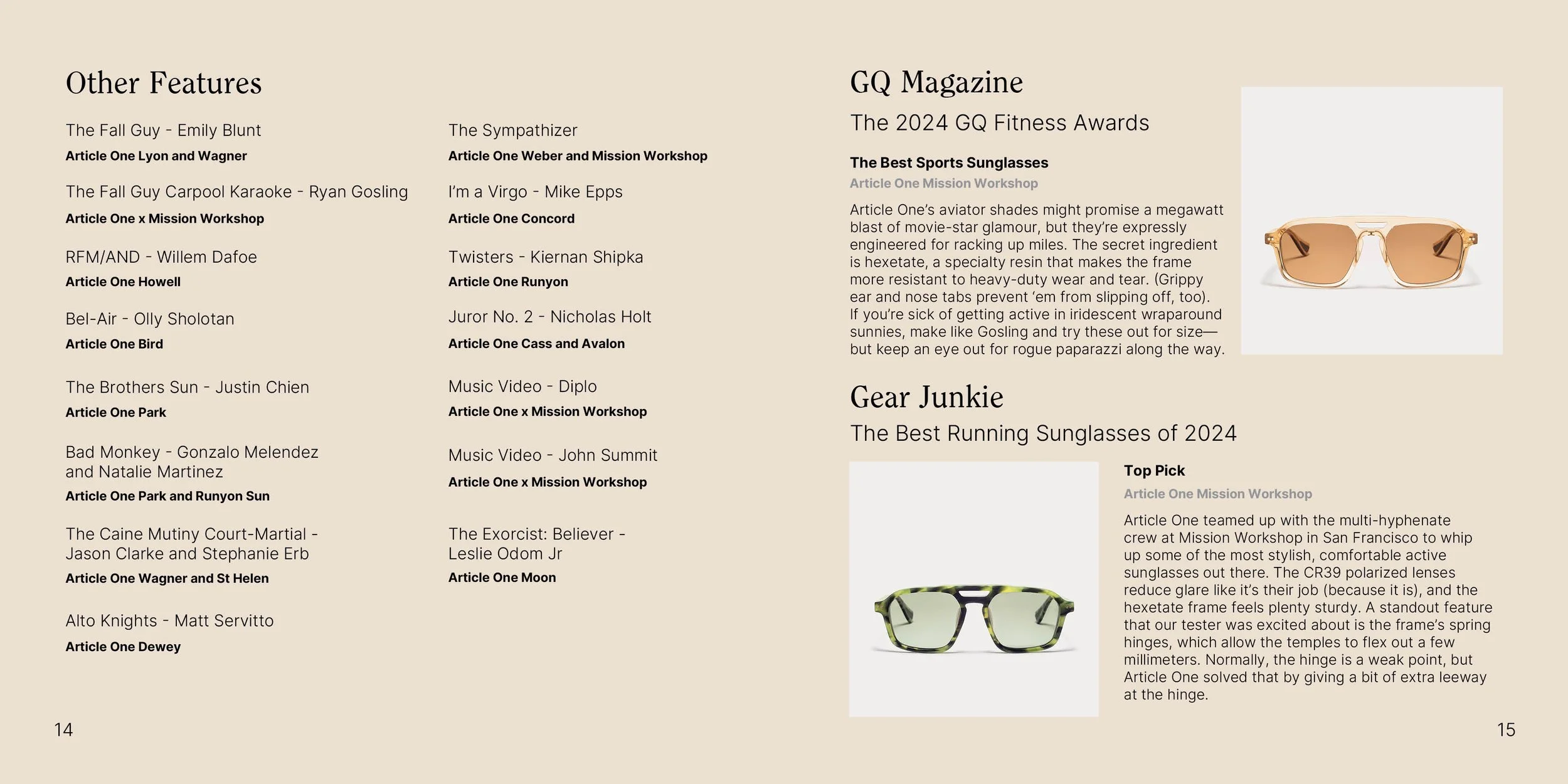
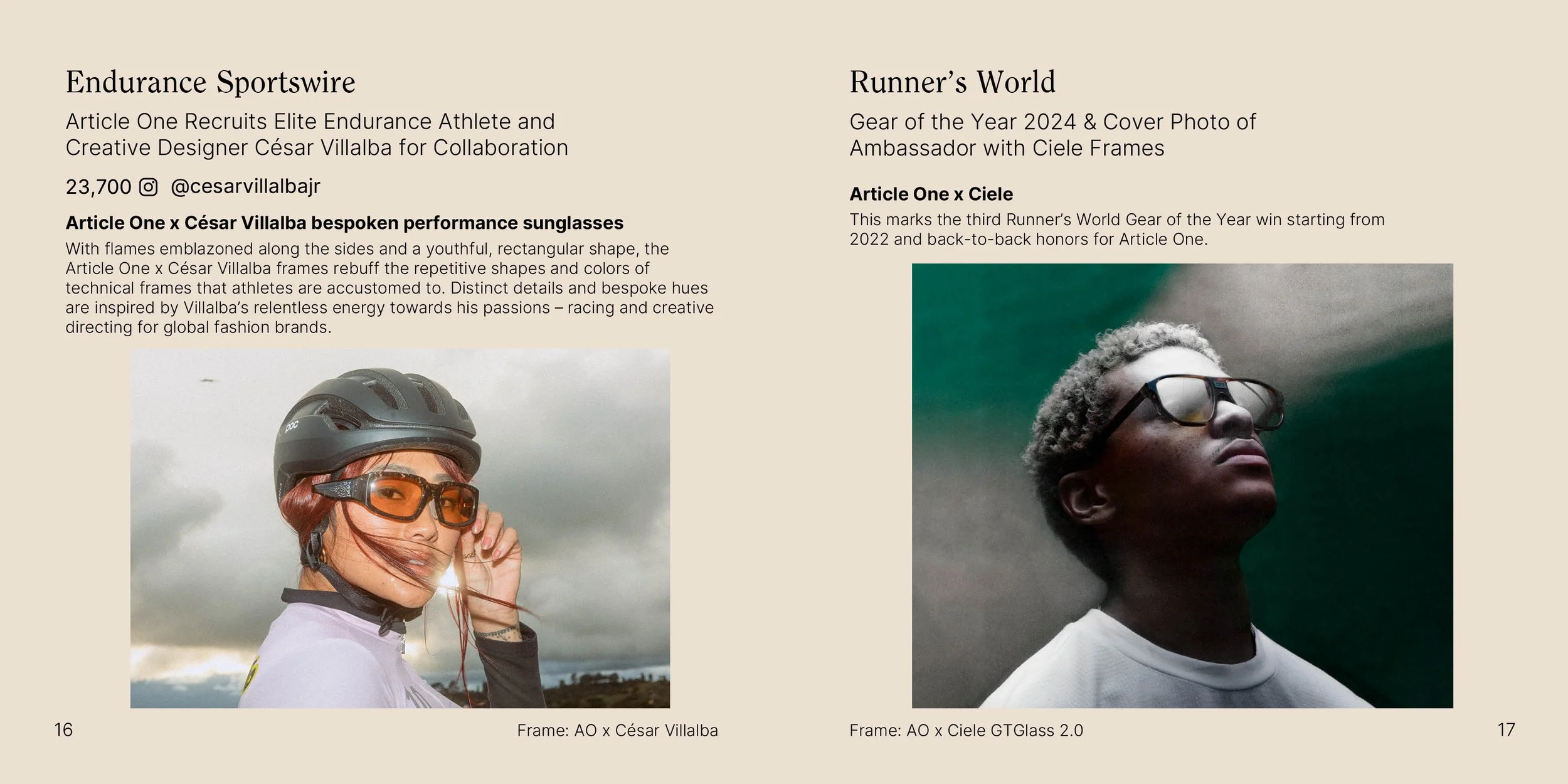
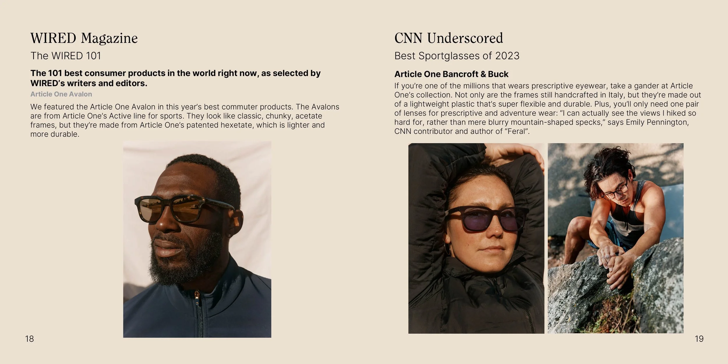
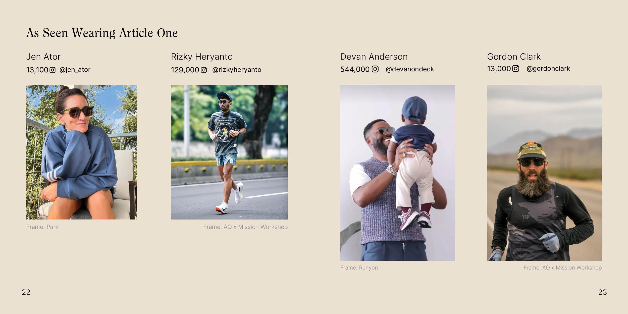
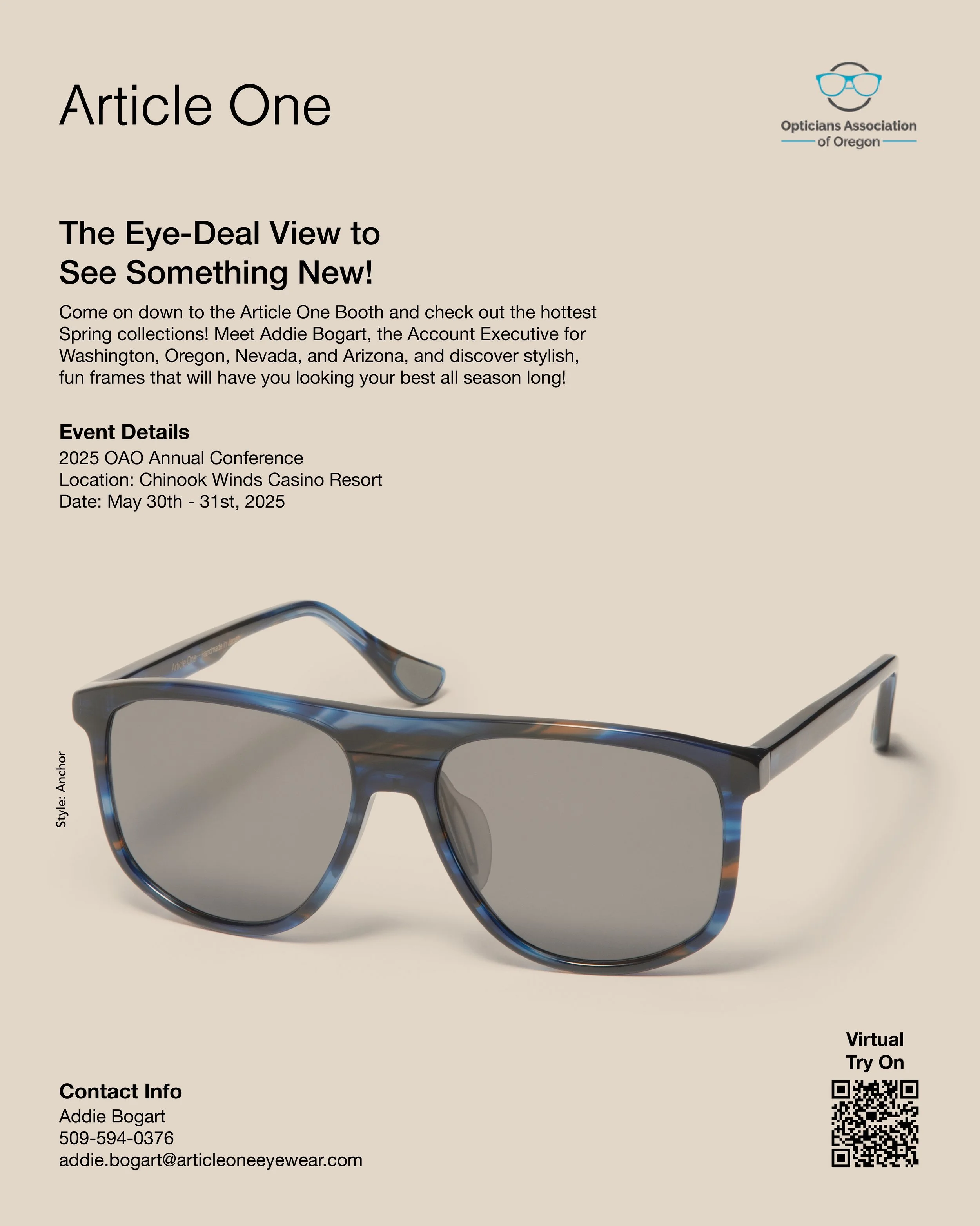
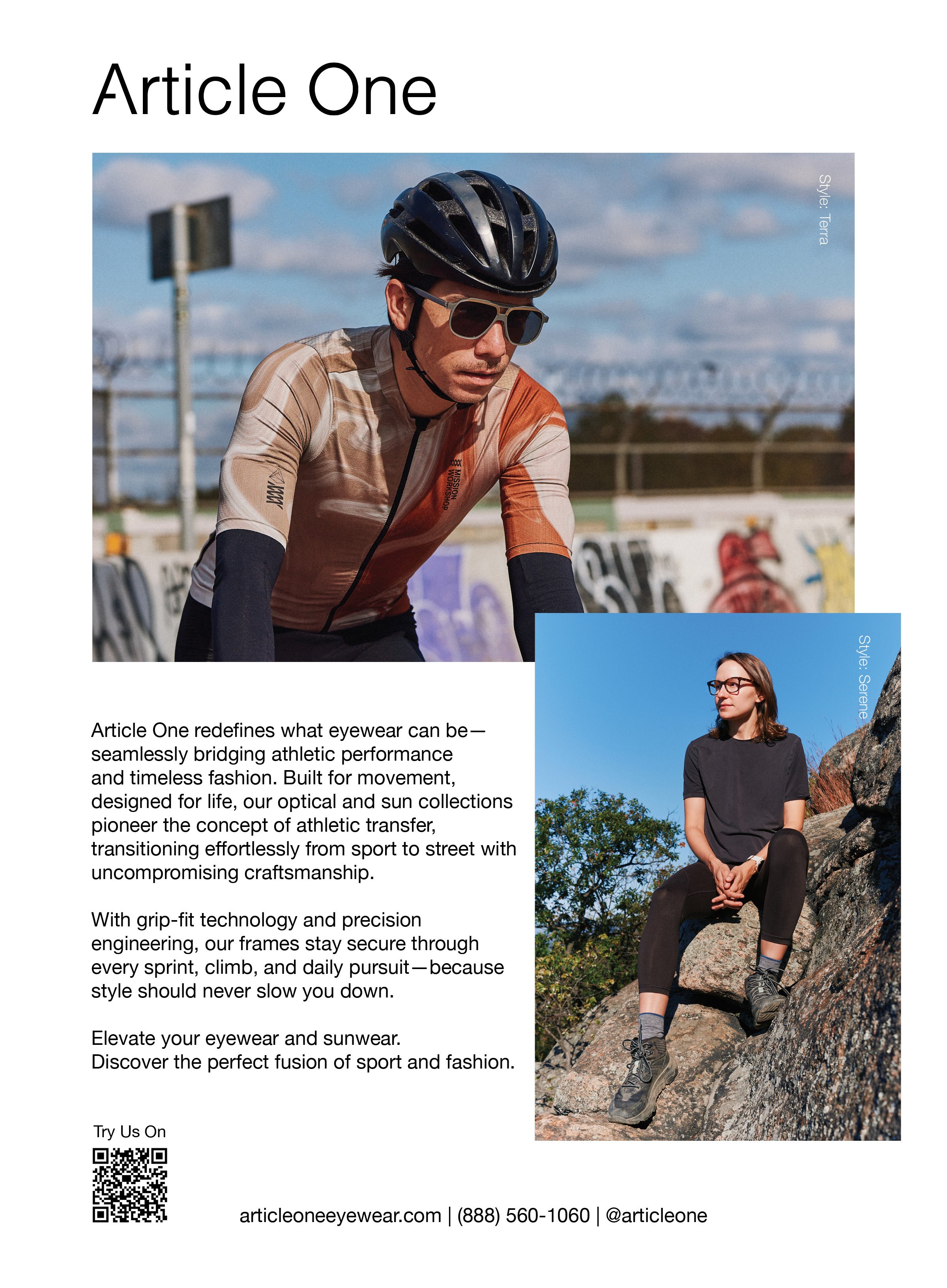
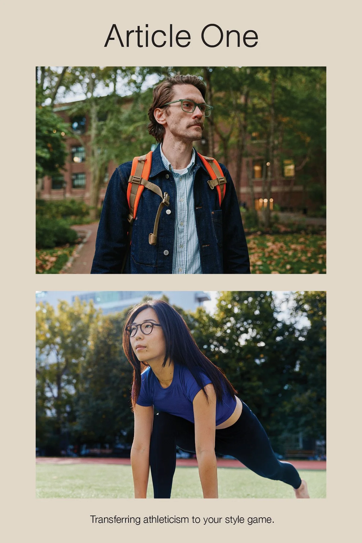
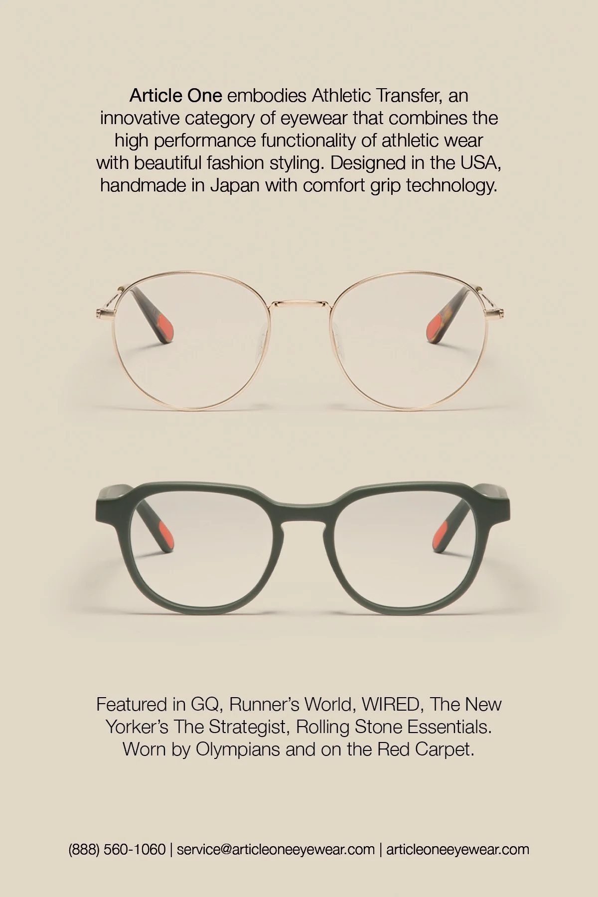
article one
This brand intersects sport and casual design, blending performance with personal style. My work focused on refining their visual language through printed collateral including PR booklets, postcards/leave behinds, and even magazine ads. I crafted designs that highlighted their commitment to functionality and purpose-driven aesthetics using simple layout design and emphasizing their high-quality photography.


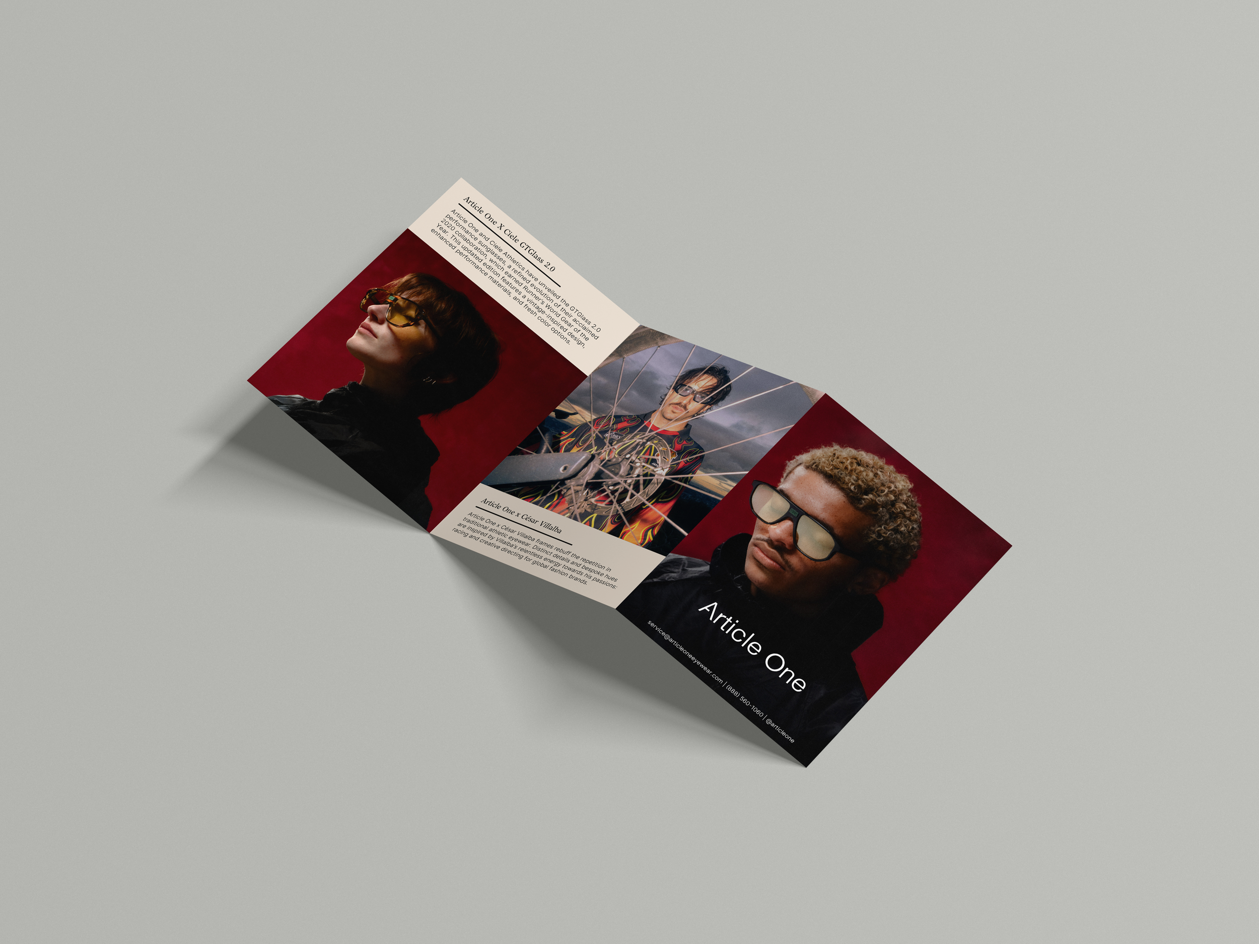
Z-Fold (Front)
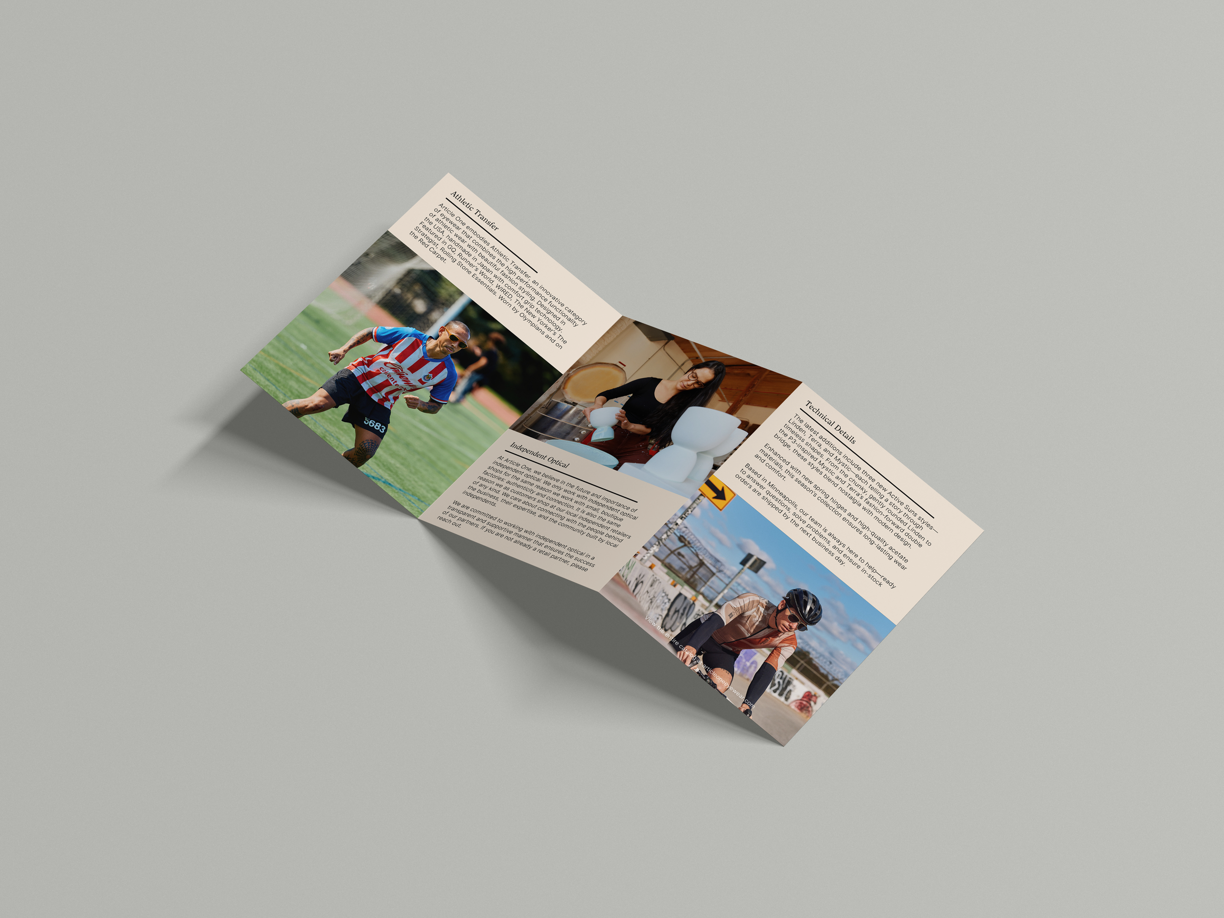
Z-Fold (Back)
Social Post
Magazine Ad


red rose
More coming soon….
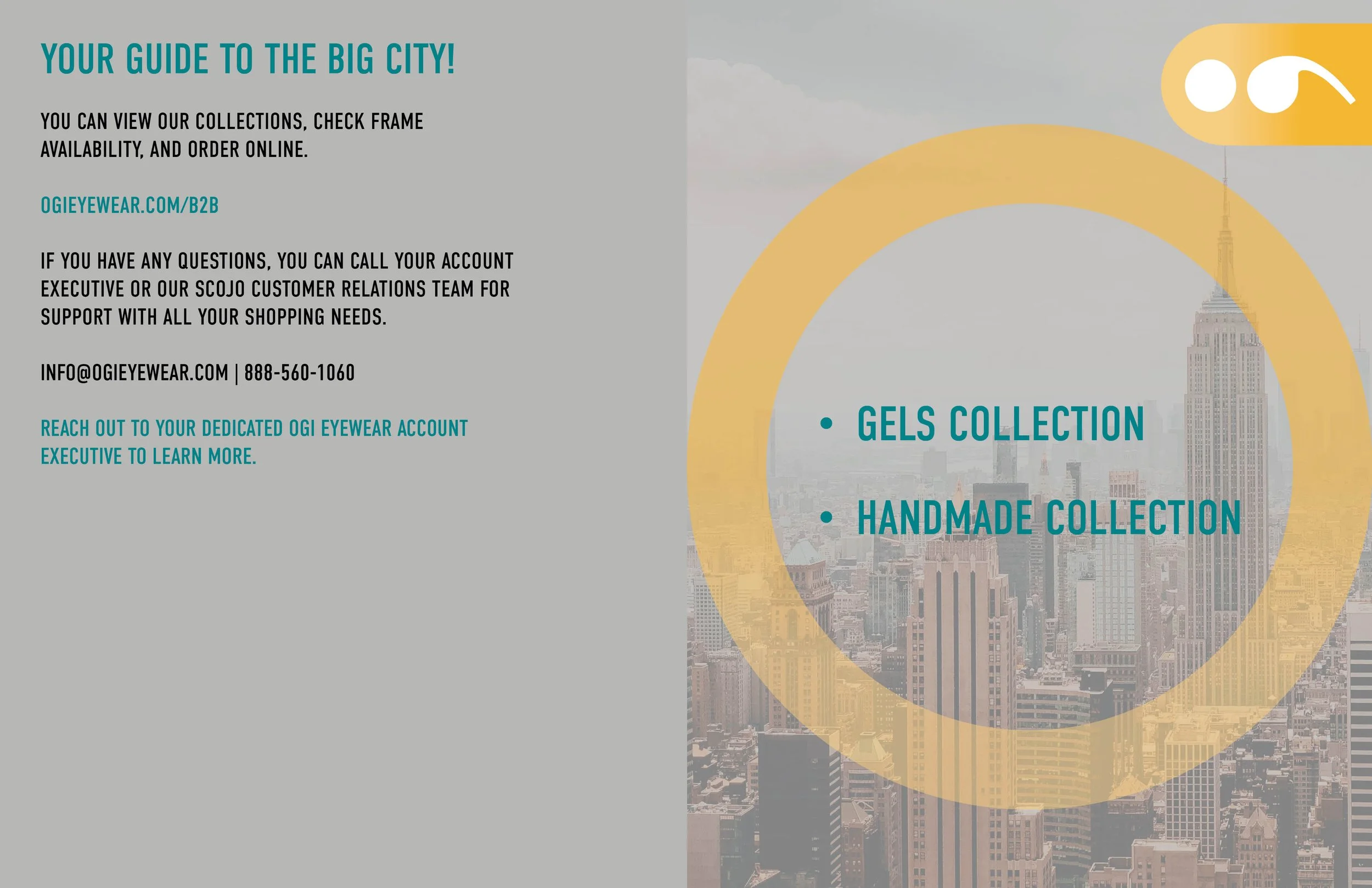
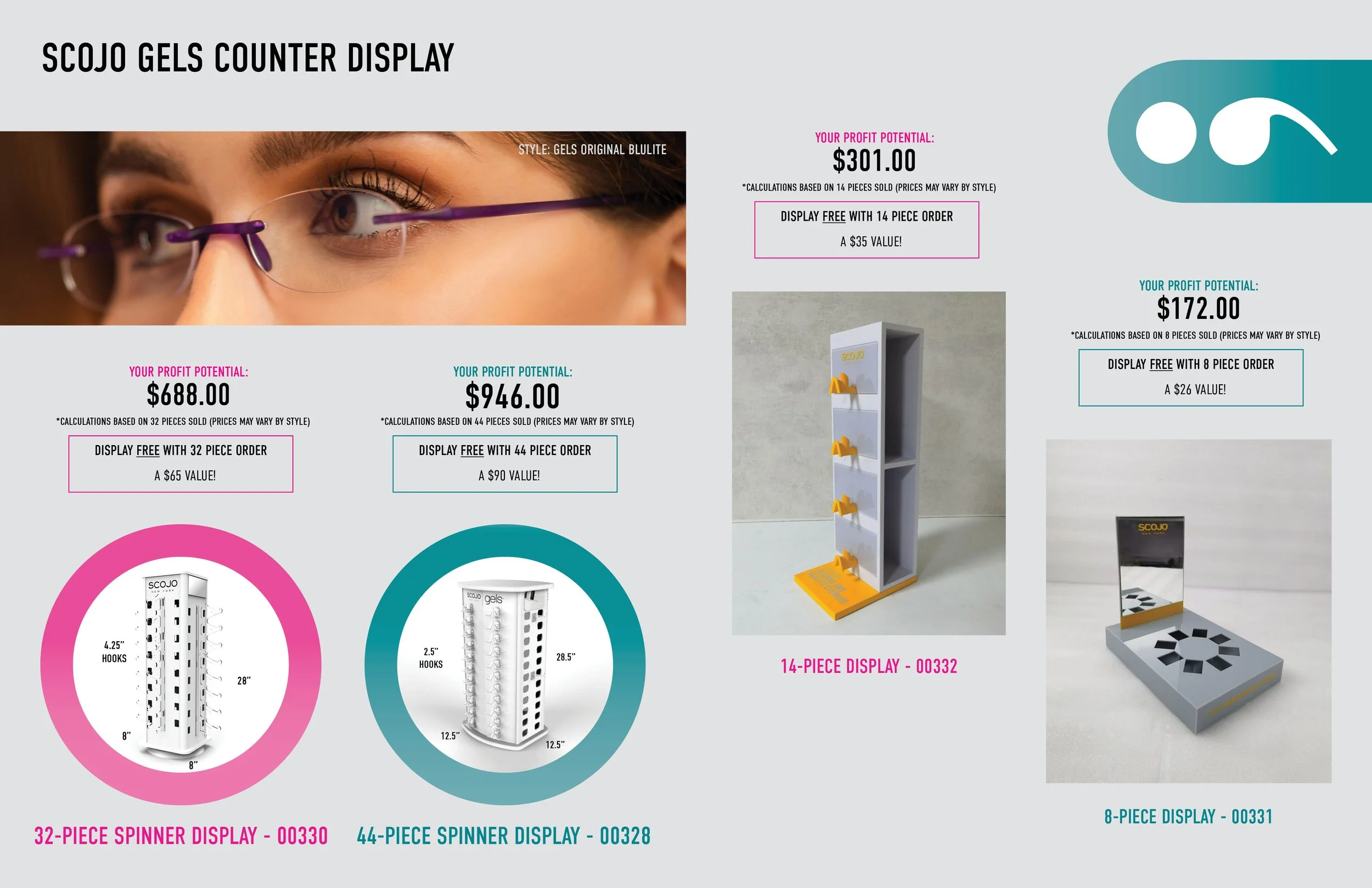
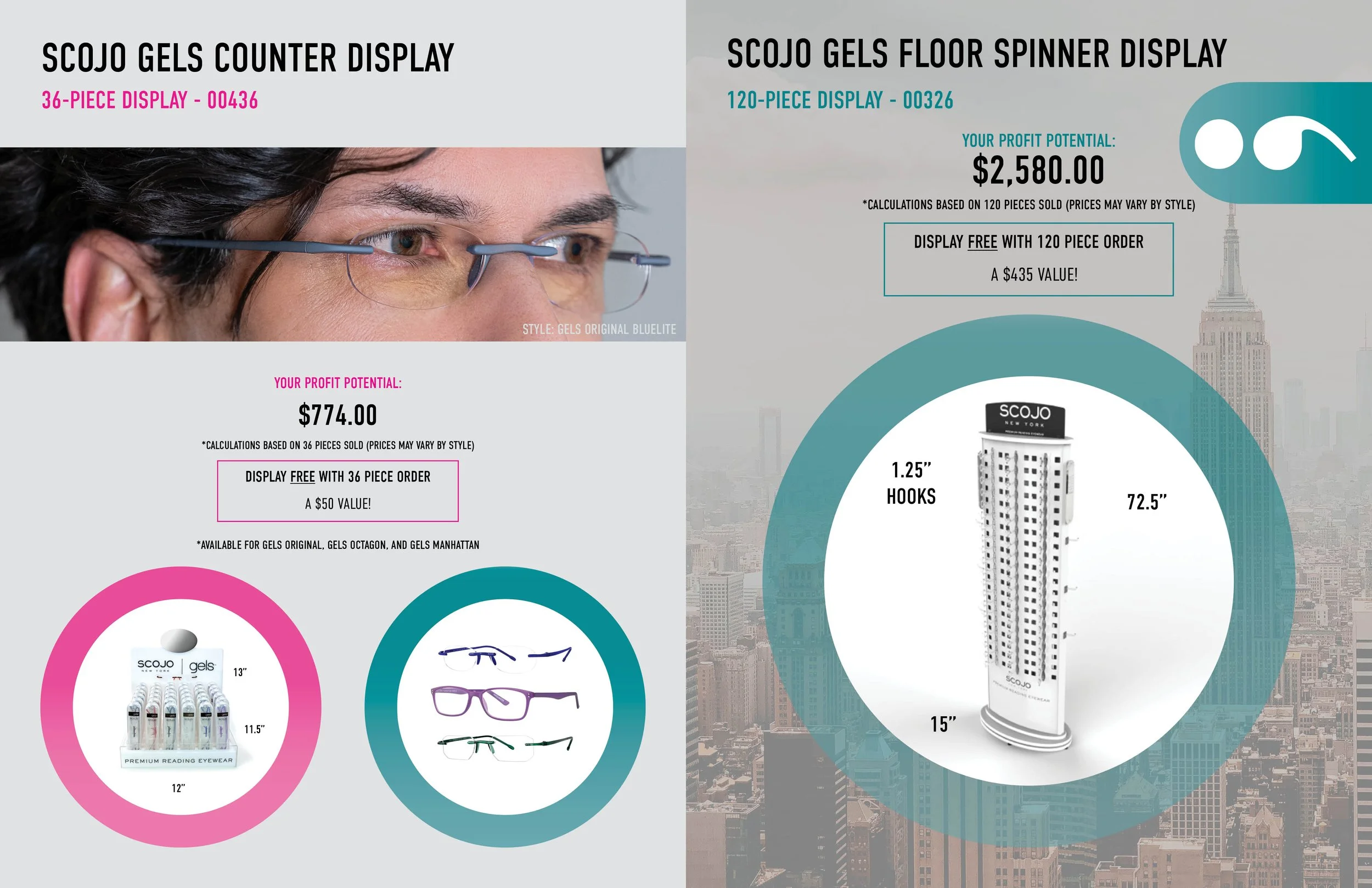
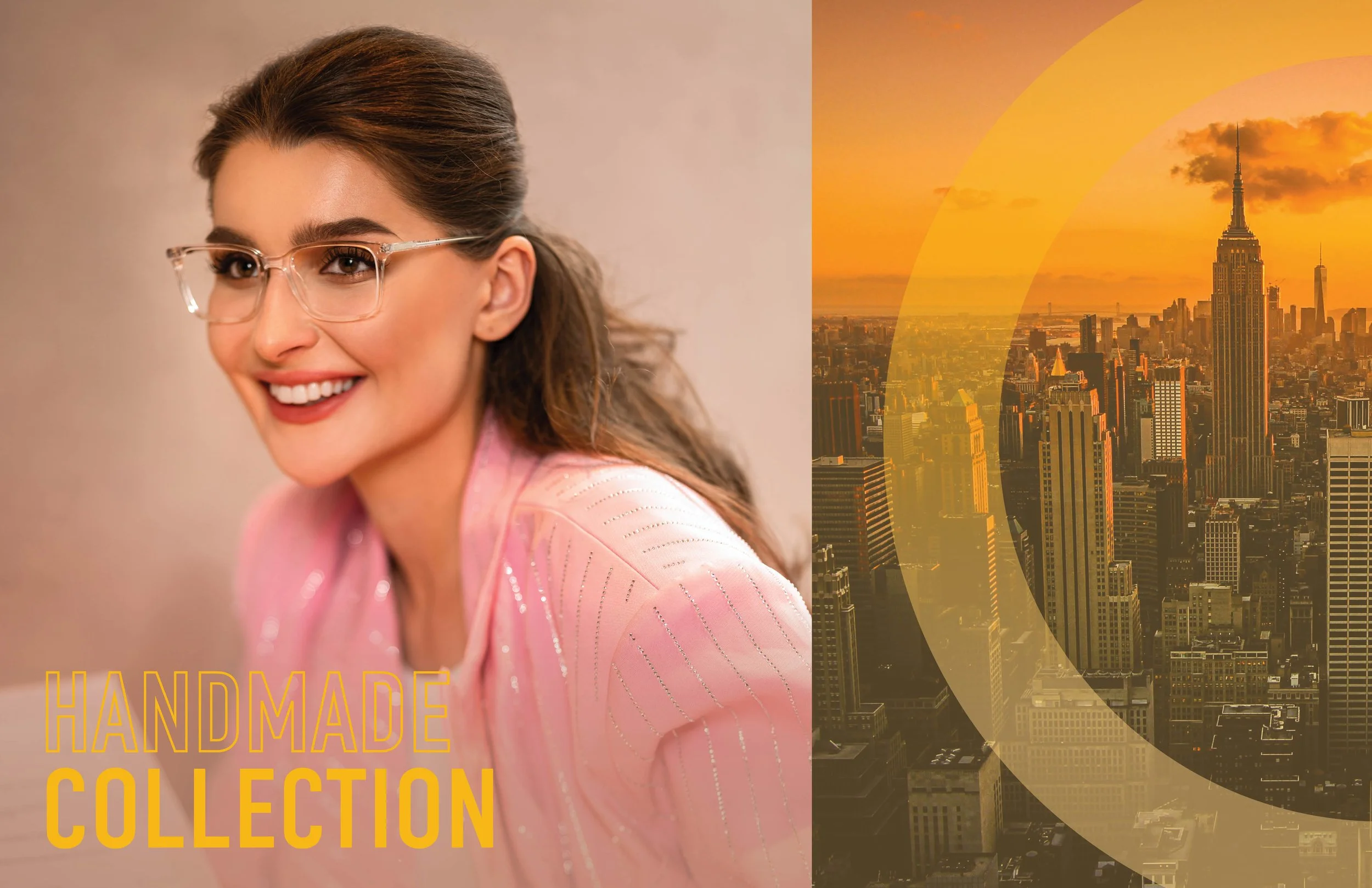
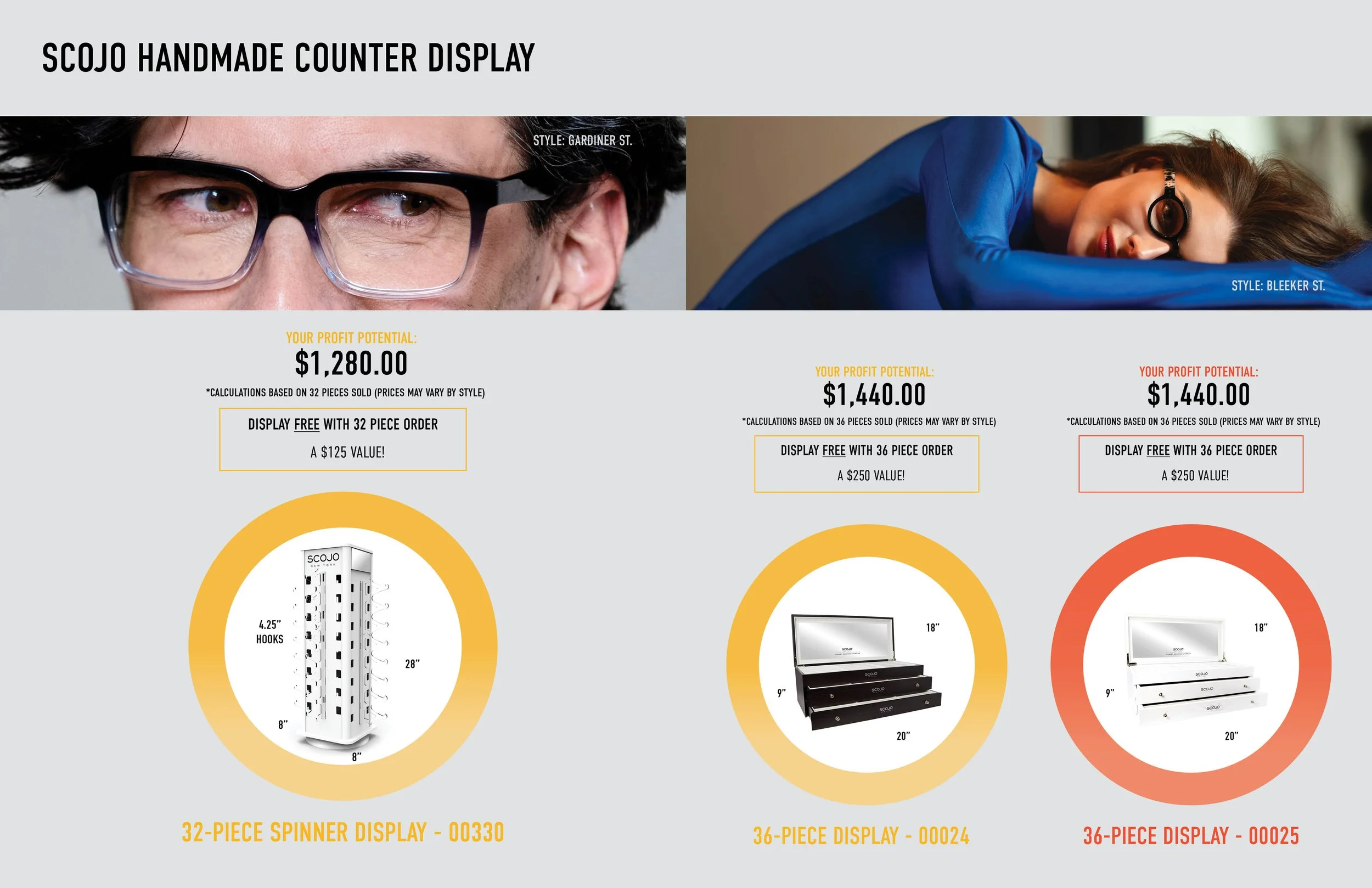
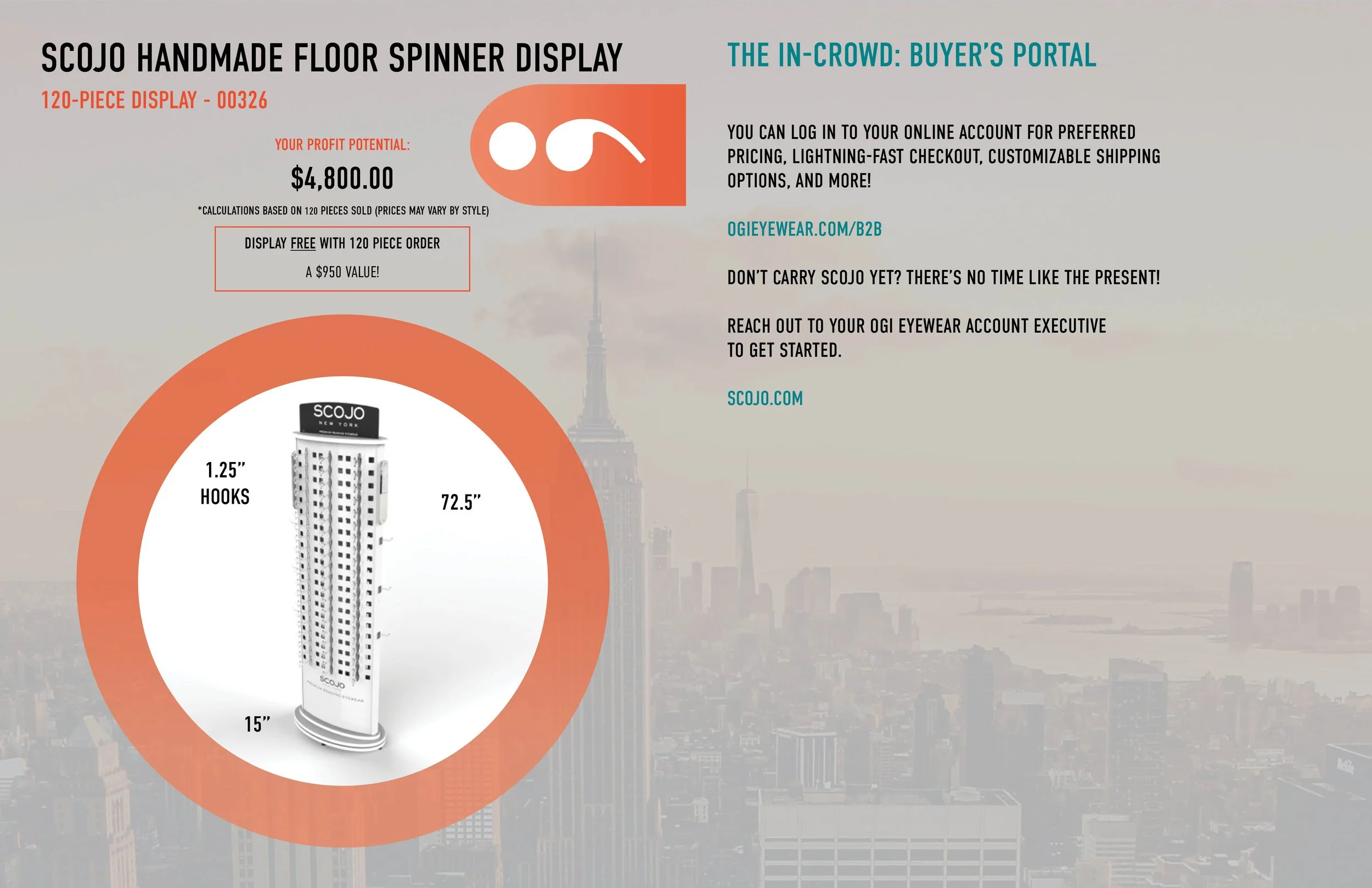
scojo New york
Merging sophistication with everyday wearability, SCOJO New York delivers elevated reading eyewear that feels both fashionable and practical. I created a Display Guide Booklet to support in-store merchandising, designed to reflect the brand’s elevated tone through clean layout systems, soft palettes, and a focus on clarity and simplicity. I’m currently participating in the revamp of the brand’s identify (coming soon…) into a more elegant downtown new yorker’s aesthetic.


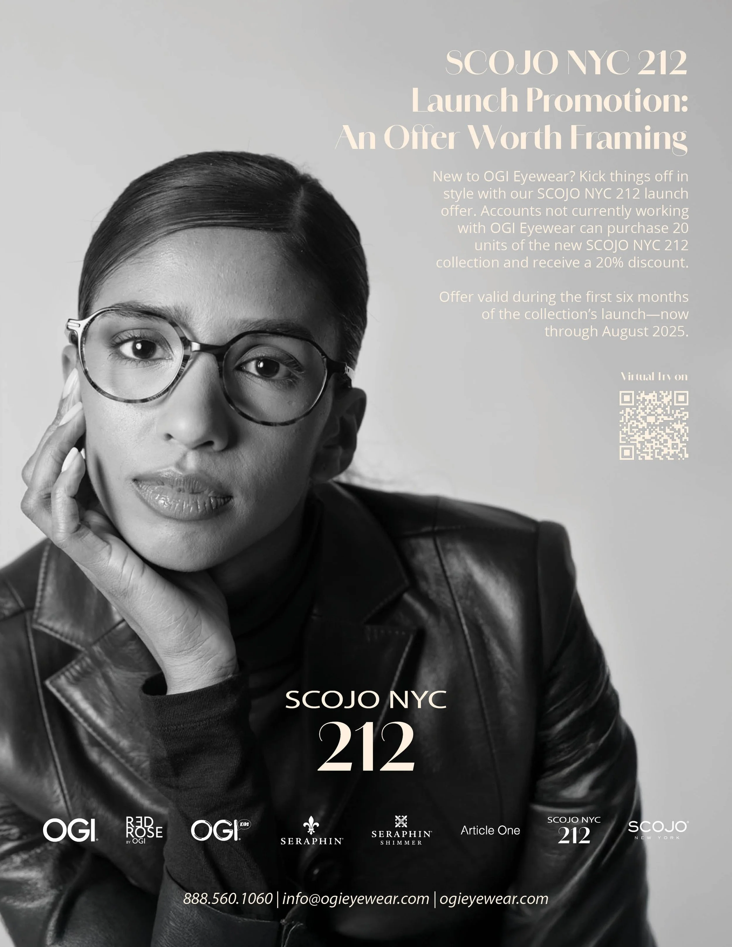
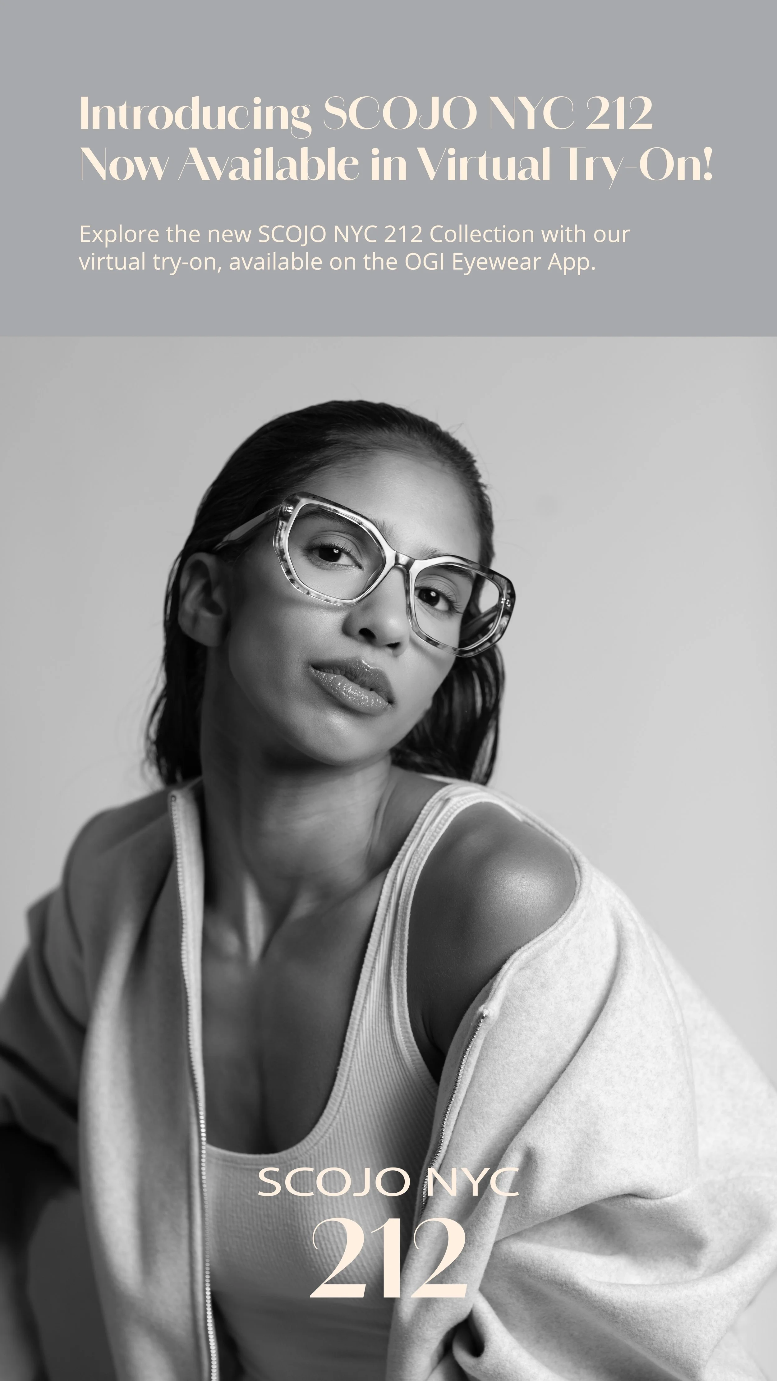
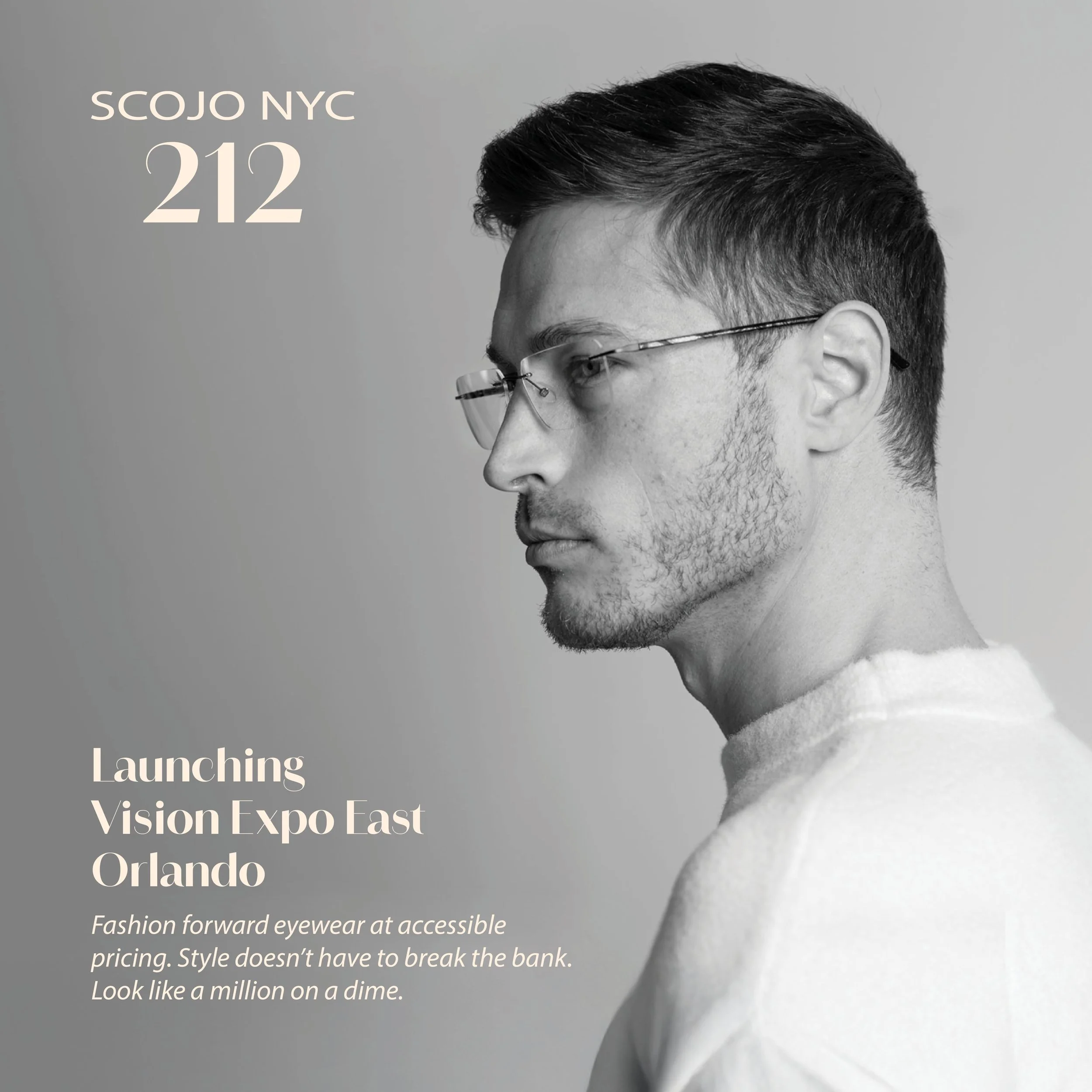
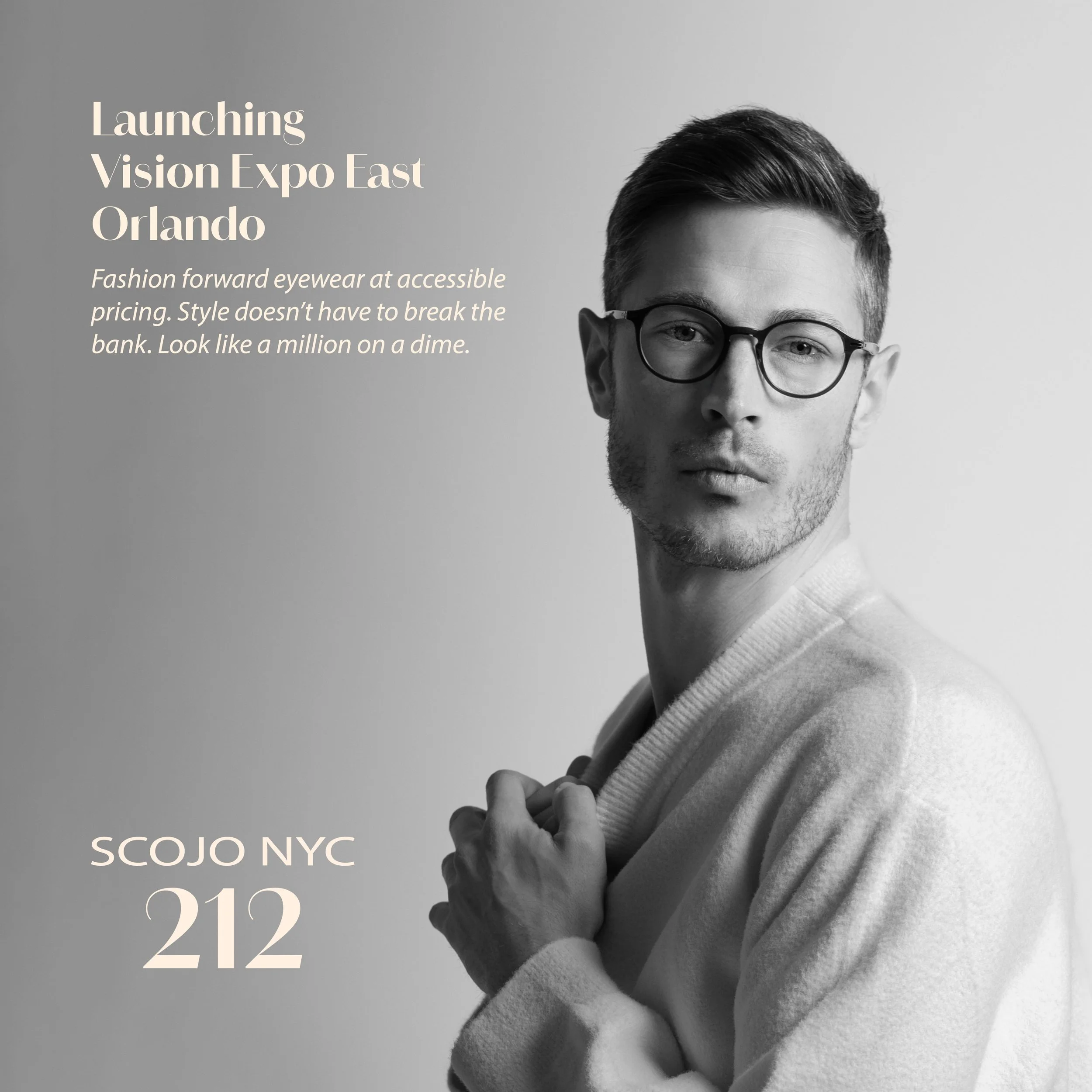
scojo nyc 212
Capturing the spirit of downtown NYC, this line blends bold style with everyday wearability. I often used black and white photography, expressive typography, and strong layout contrasts. Whether for digital or point-of-purchase pieces, each design leaned into the brand’s street-smart attitude while staying aligned with its identity.